Background
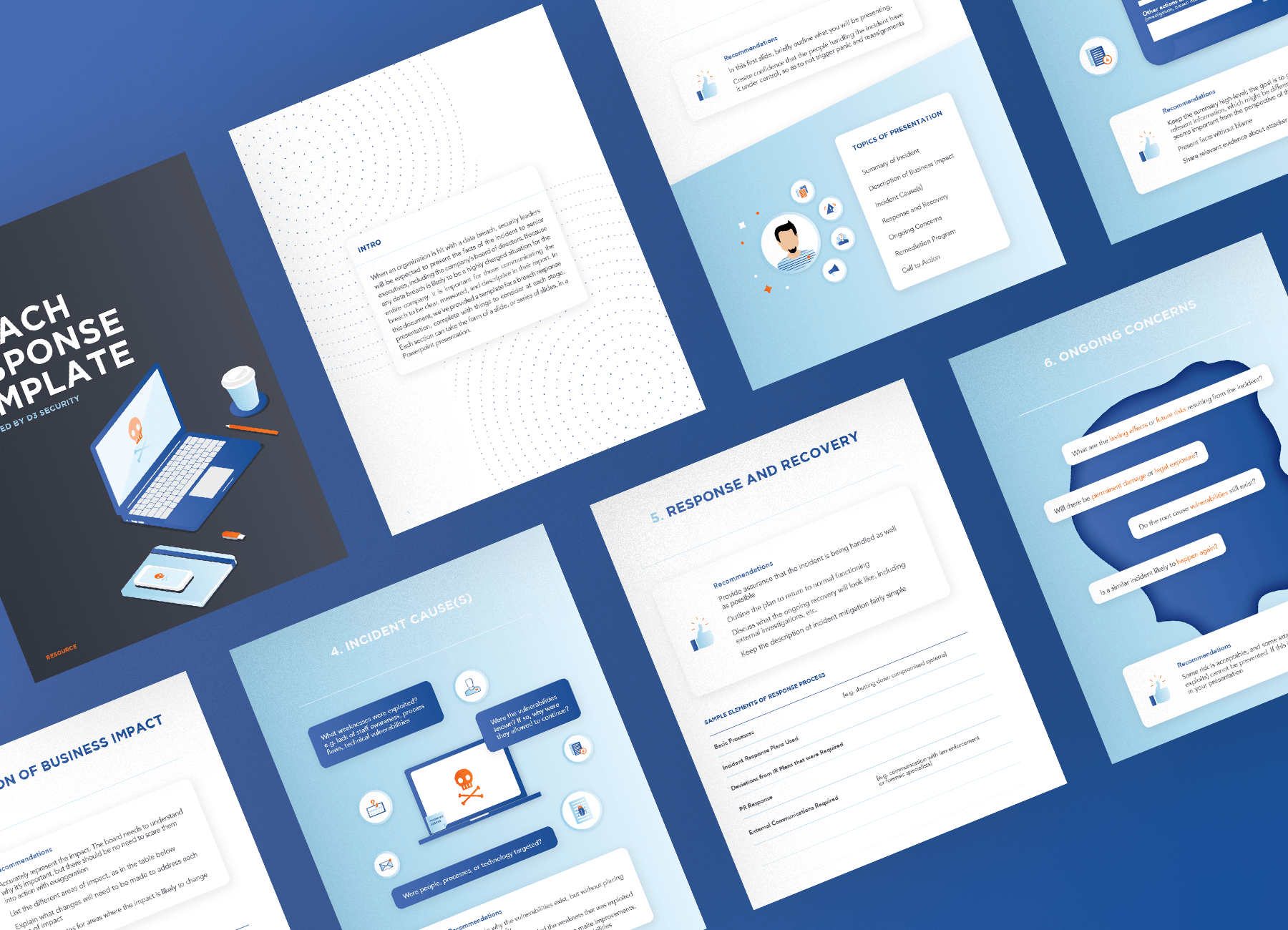
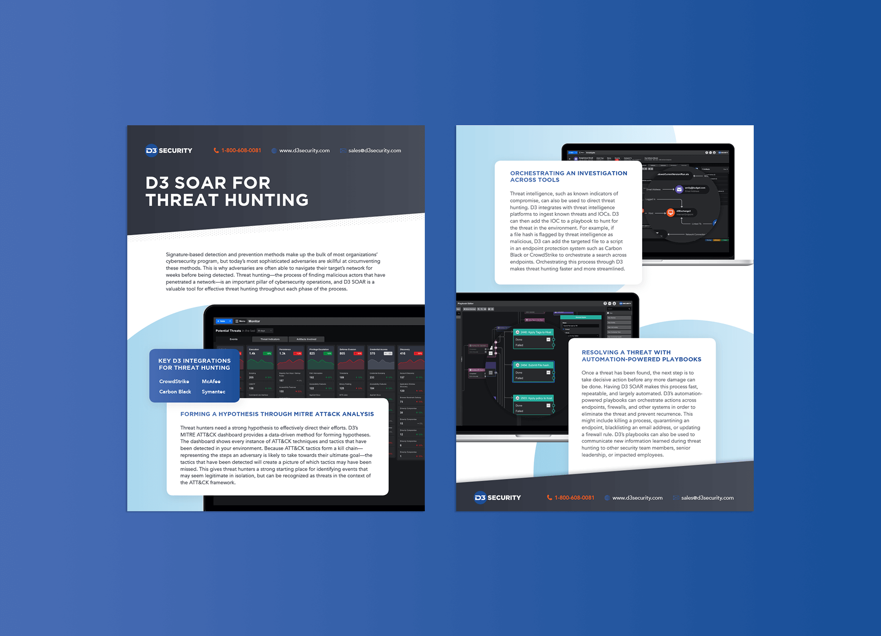
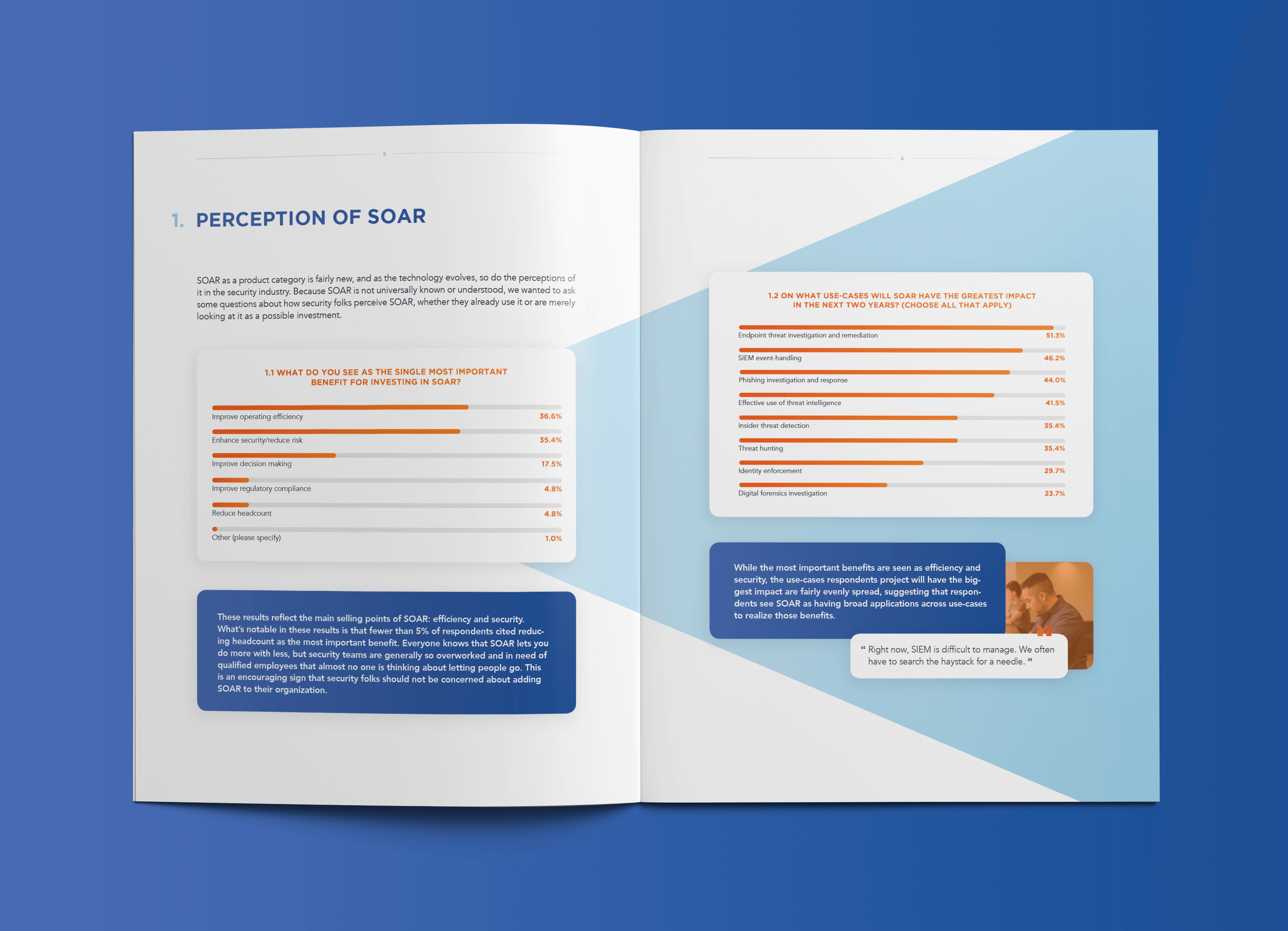
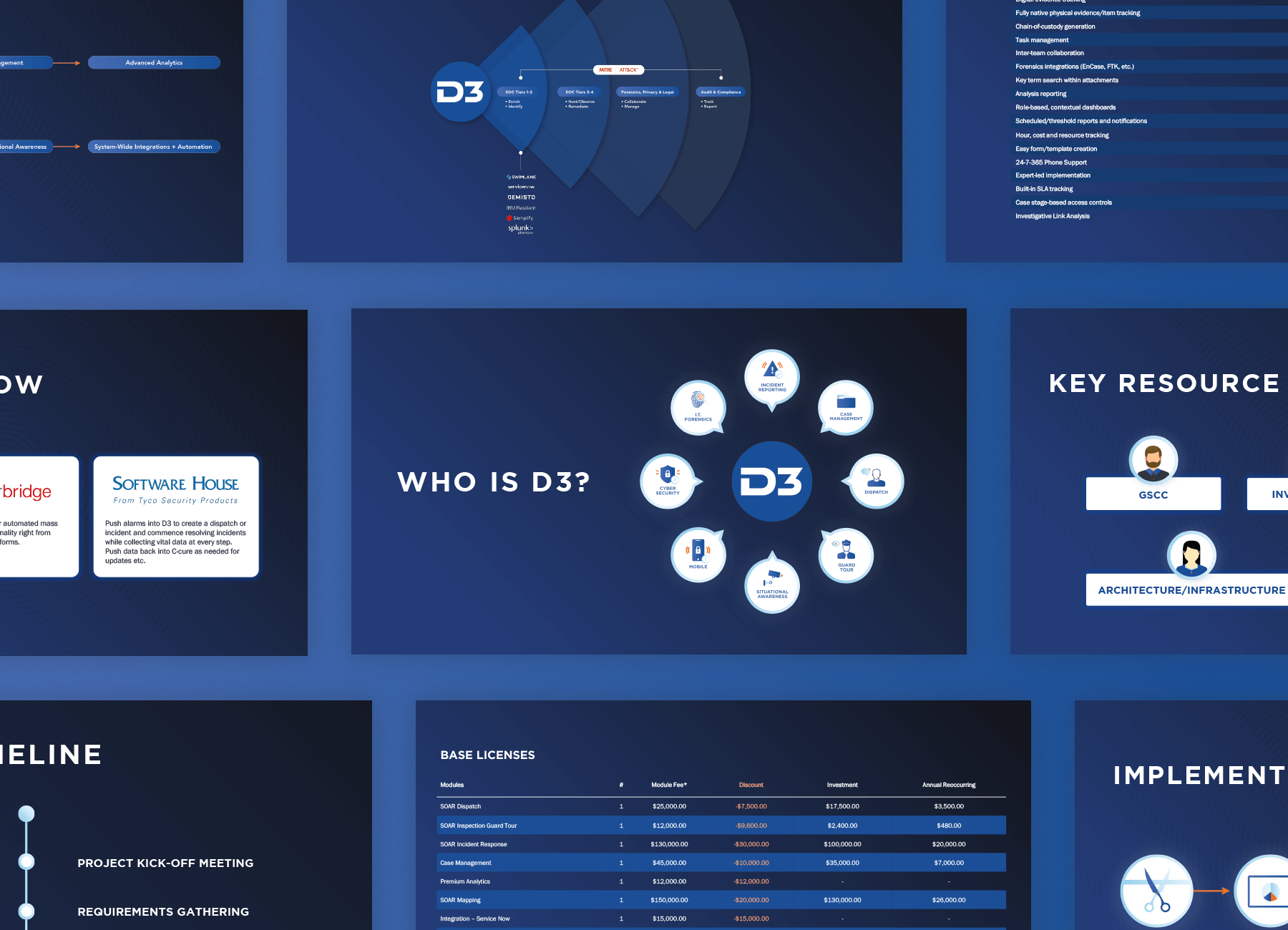
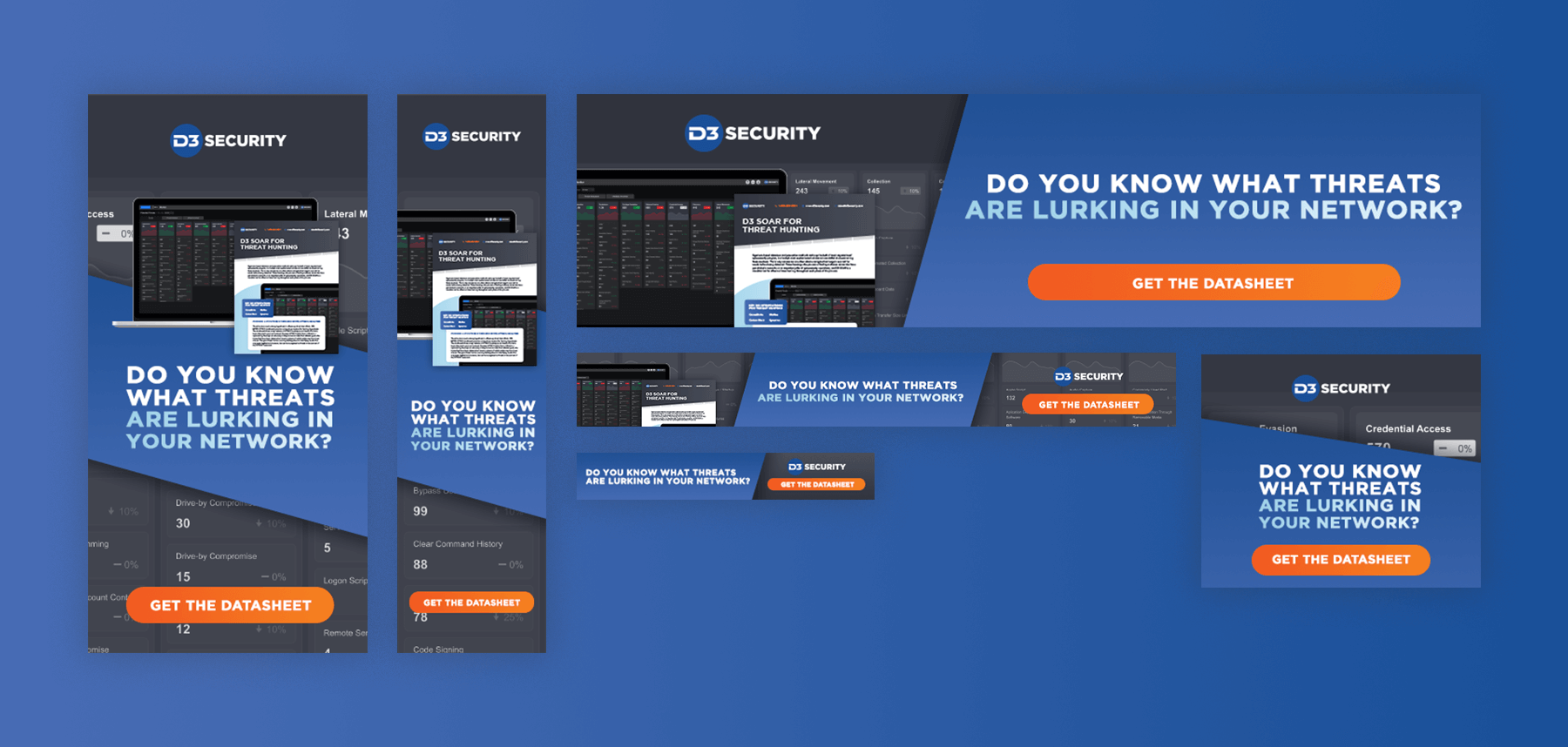
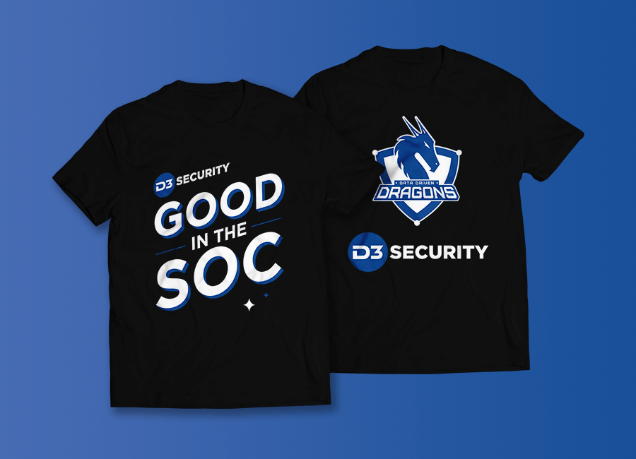
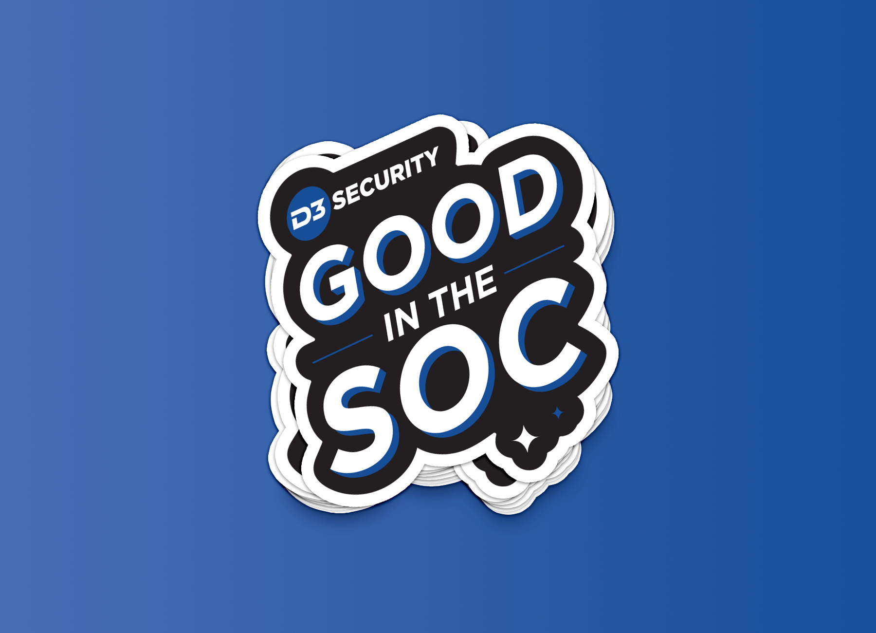
As D3 Security was expanding, they needed an in-house graphic designer to support their growing marketing needs. At the time, the Marketing department consisted of just two people—a Marketing Director and a copywriter. To create design materials, the team mostly relied on PowerPoint or hired freelancers for larger projects. My role was to develop a cohesive brand identity that aligned with the existing logo. I designed various assets, including icons, diagrams, PDFs, PowerPoint presentations, tradeshow materials, and AdWords banners.
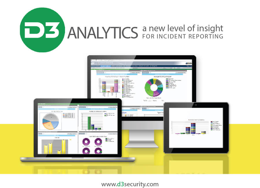
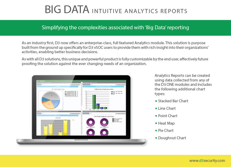
A sample of the previous branding
Design Challenges
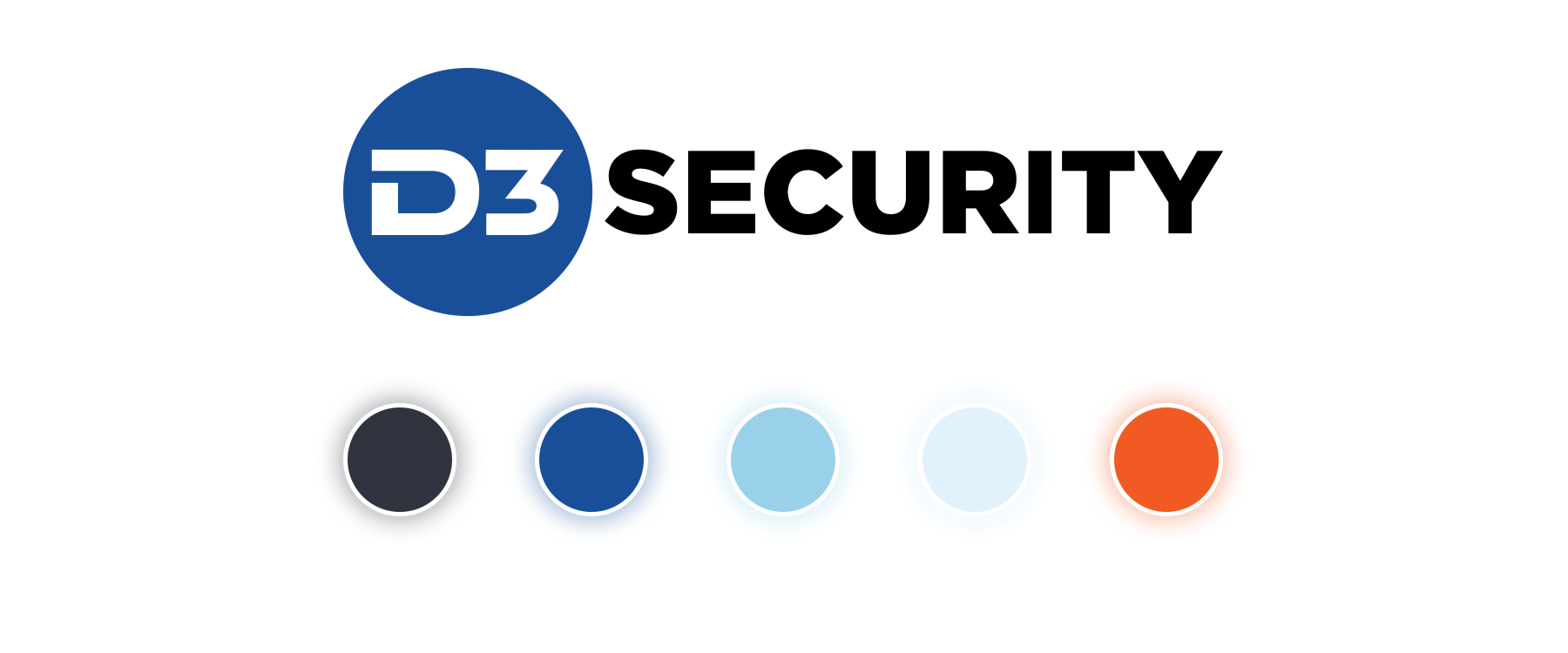
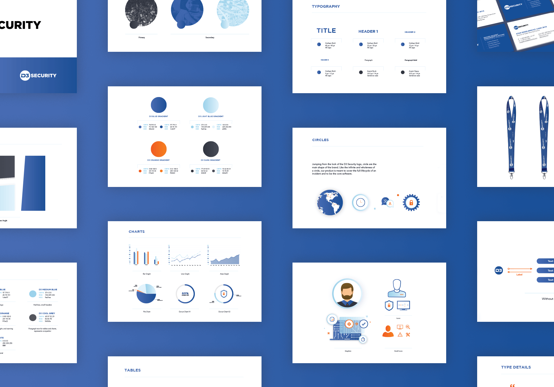
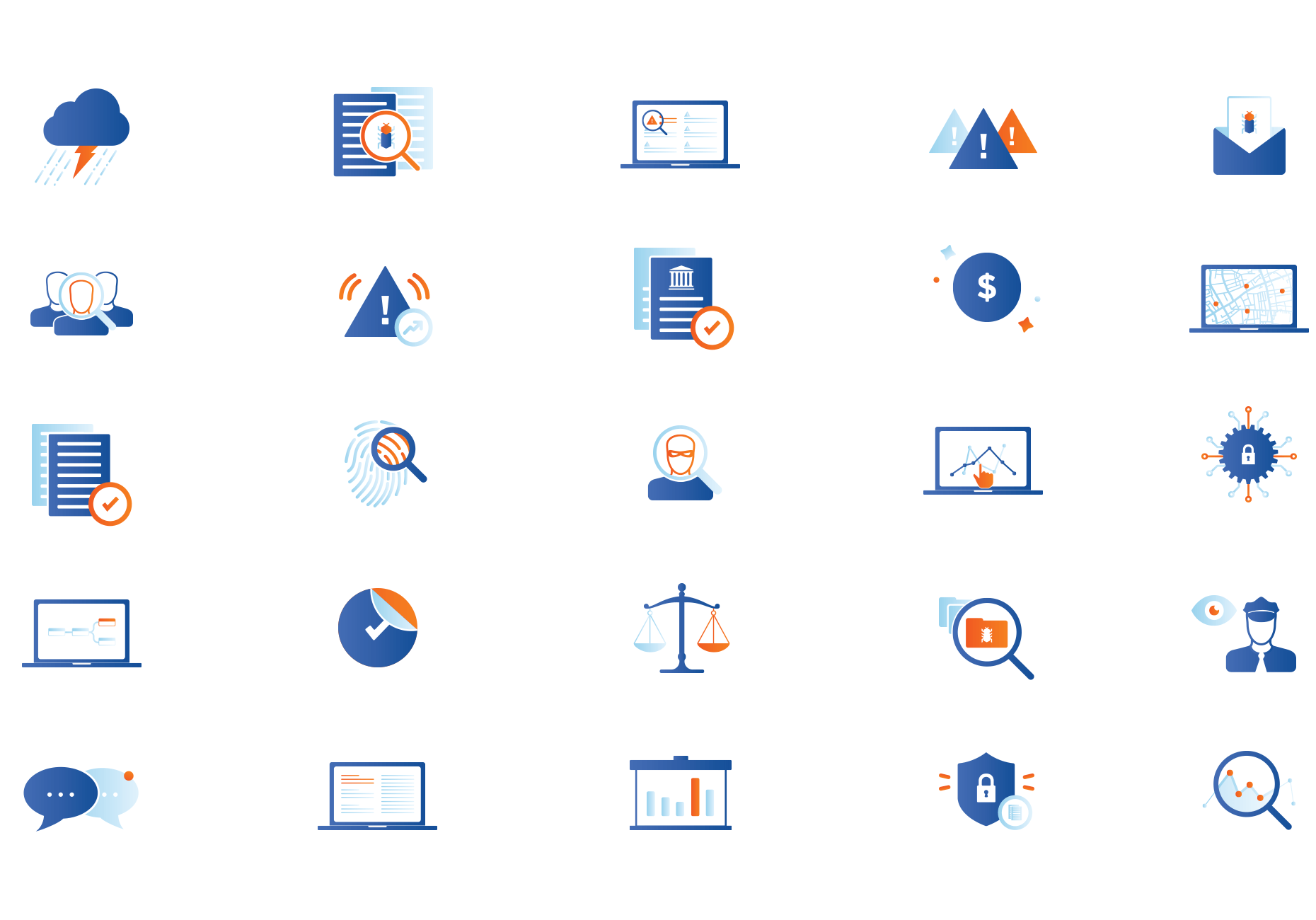
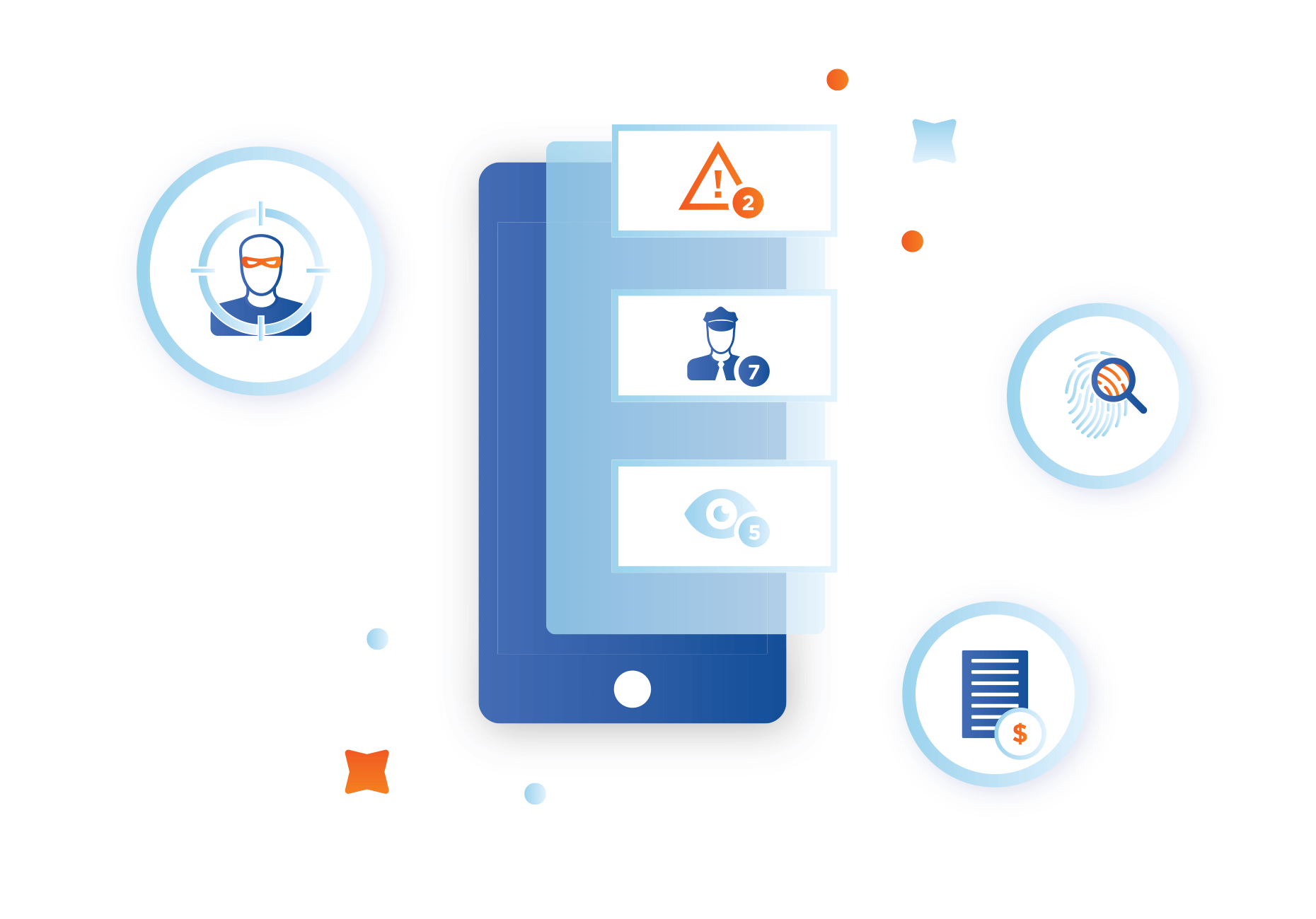
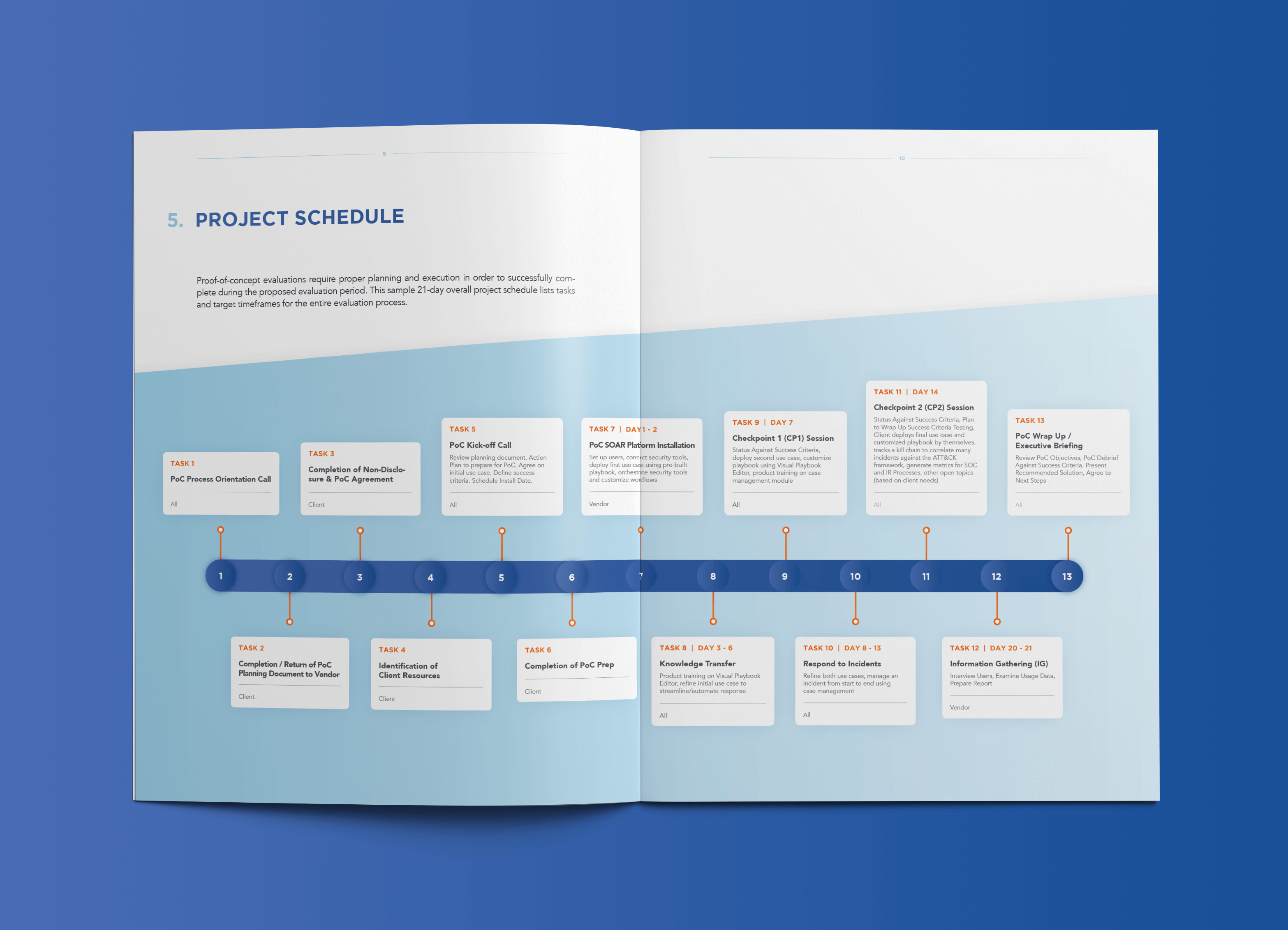
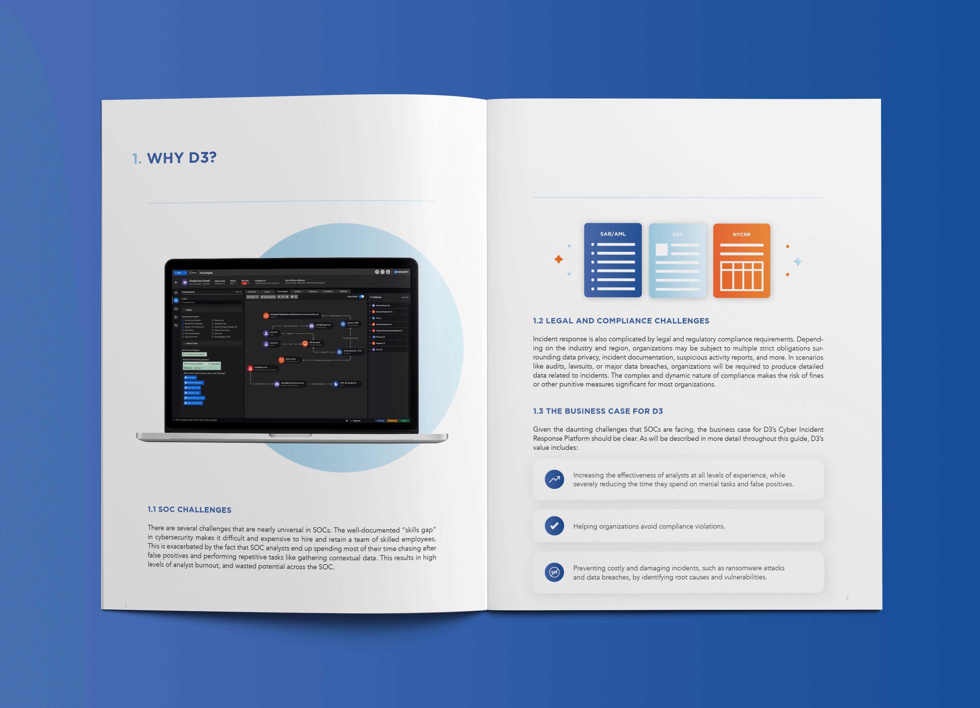
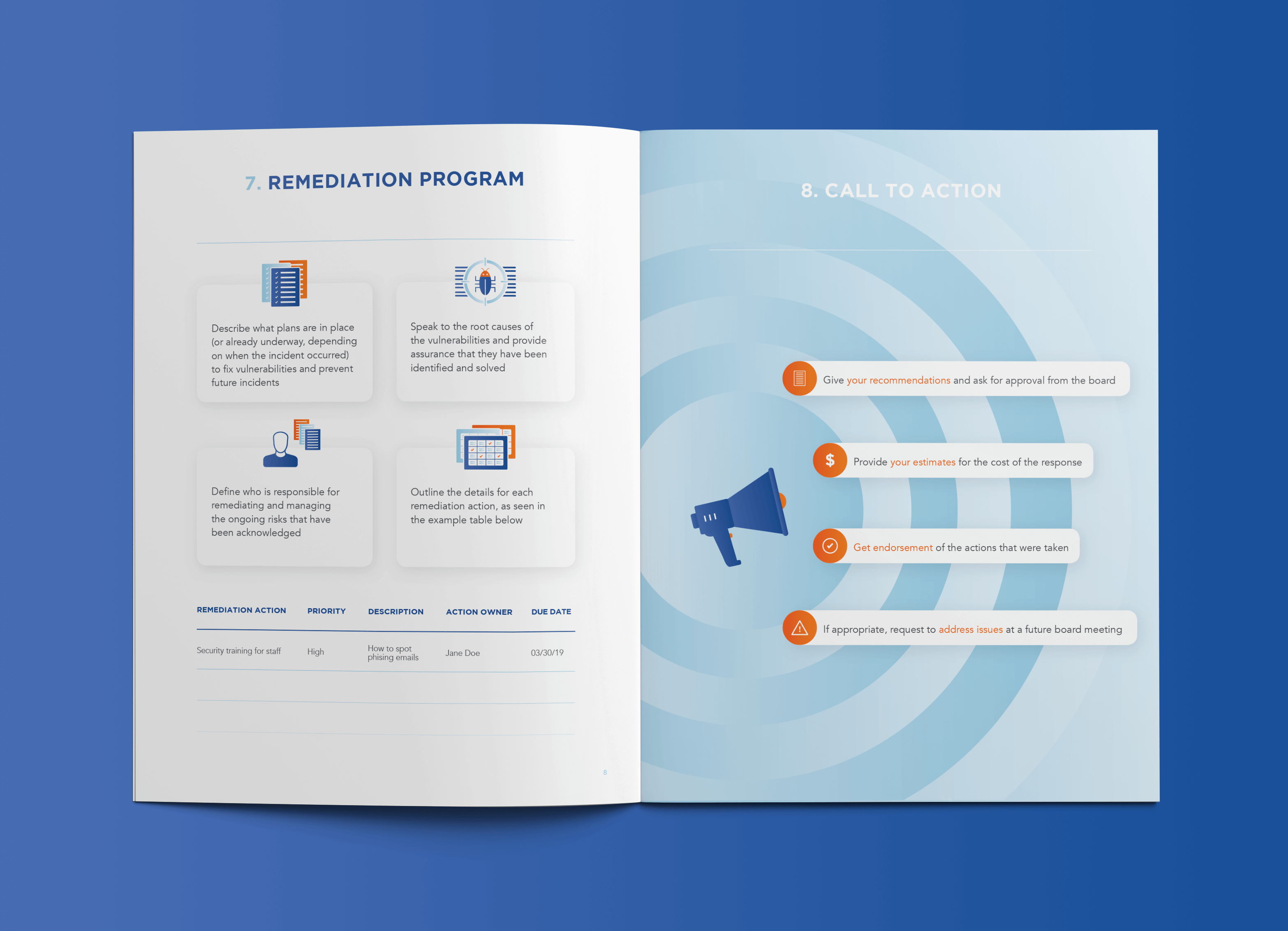
I began my role in the middle of tradeshow season with a website redesign just three months away. The immediate goal was to finalize the current tradeshow designs while laying the foundation for our rebrand by solidifying our color scheme and typography guidelines. Although the logo remained mostly unchanged, I made subtle updates to ensure it aligned seamlessly with the new brand direction. Using the logo as a base, I expanded on elements like circles and rounded corners to represent the infinite and holistic nature of our product, which covers the full lifecycle of a security incident. Over the next two months, I developed a comprehensive style guide for custom icons, diagrams, and graphics.
Another challenge was that the brand had been split into two distinct entities: D3 Security and D3 Cyber. D3 Security used green and yellow, focusing on physical security features like Geo Mapping, Dispatch, and Guard Tour, while D3 Cyber used blue and focused on upcoming cybersecurity offerings. About a month into the process, we successfully convinced upper management to unify the brands under the D3 Security umbrella, simplifying our messaging.
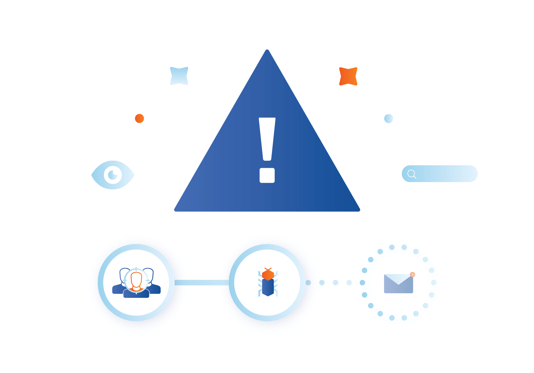
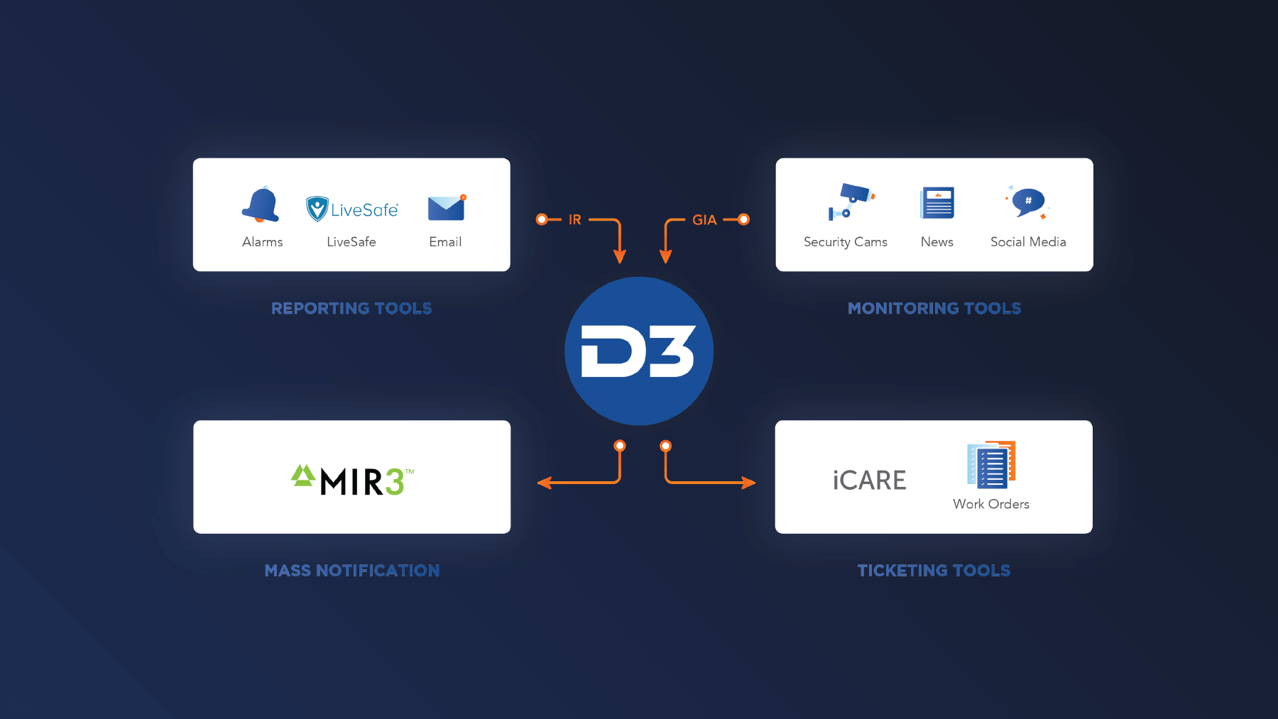
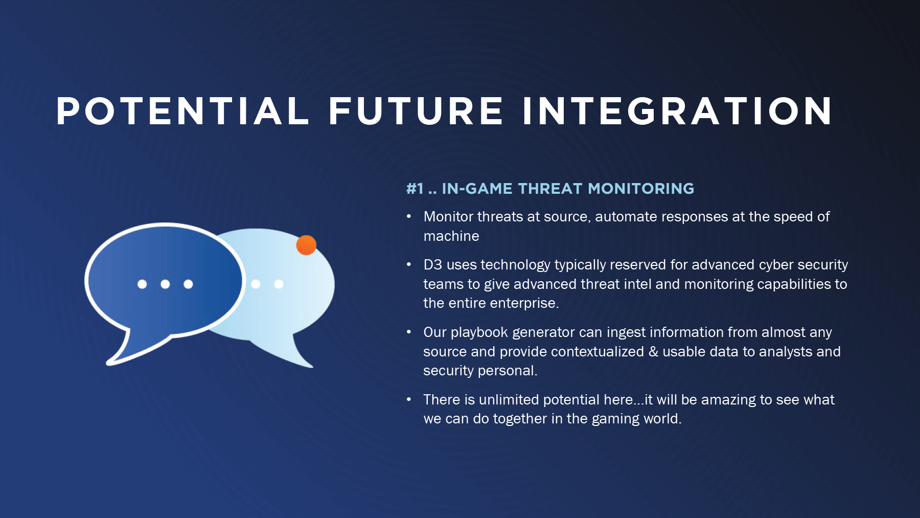
A major hurdle for both the sales and marketing teams was the outdated, complex, and cluttered UI design of the software. We leaned heavily on simplified custom graphics to better communicate the software’s functionality..
In 2019, we undertook a full brand refresh and launched a new website. Working closely with our web developer, we aligned the refreshed brand with the website’s design. We introduced gradients into the color scheme, created more polished graphics, and incorporated playful layouts to give the site a modern, engaging feel.


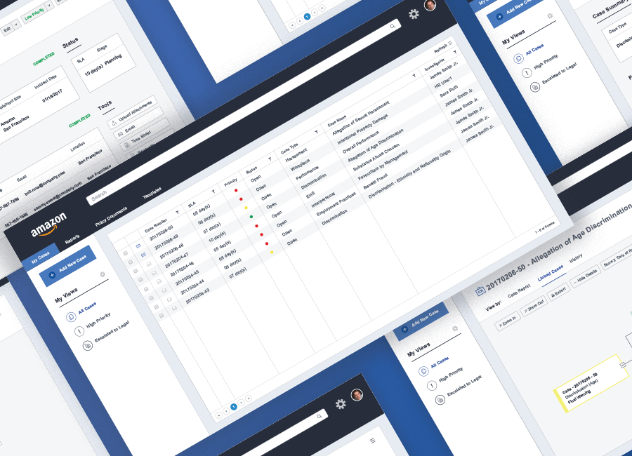
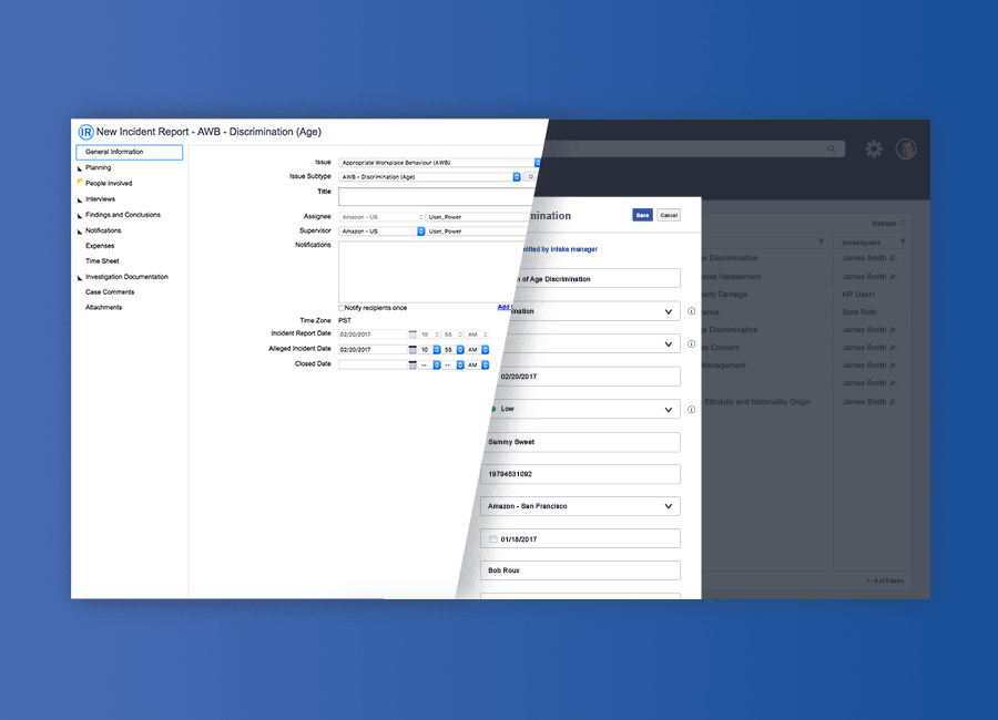
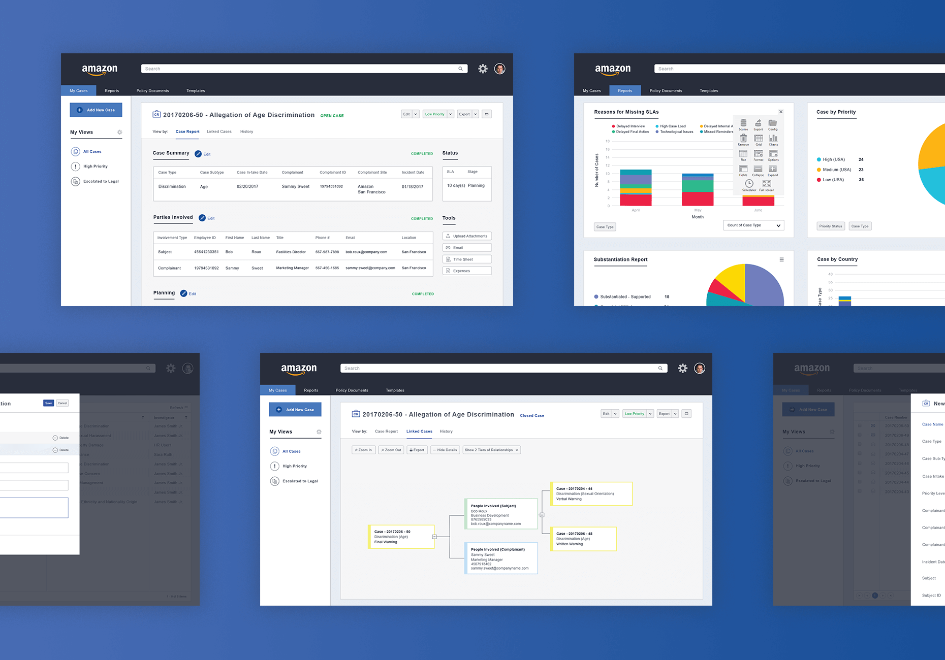
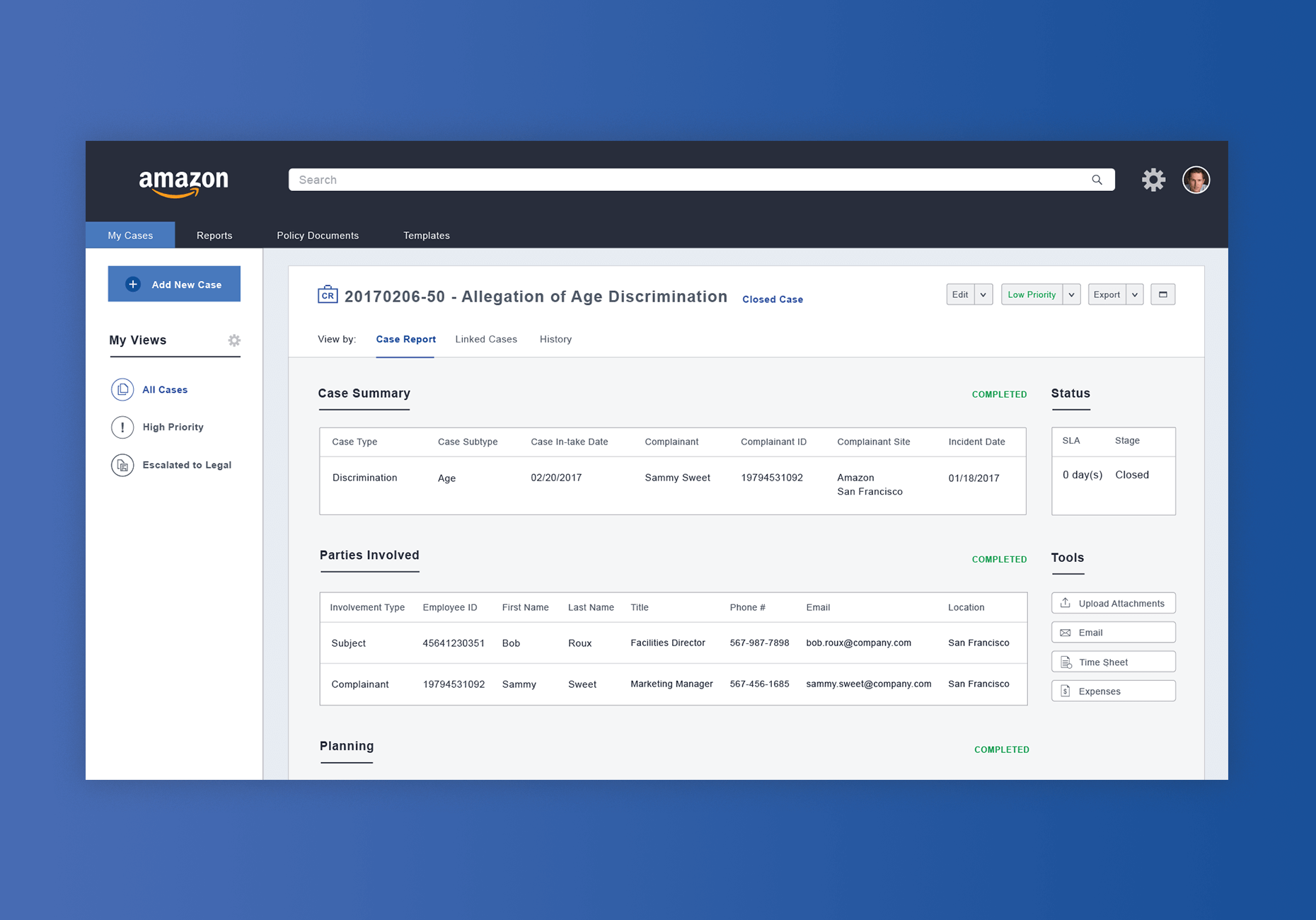
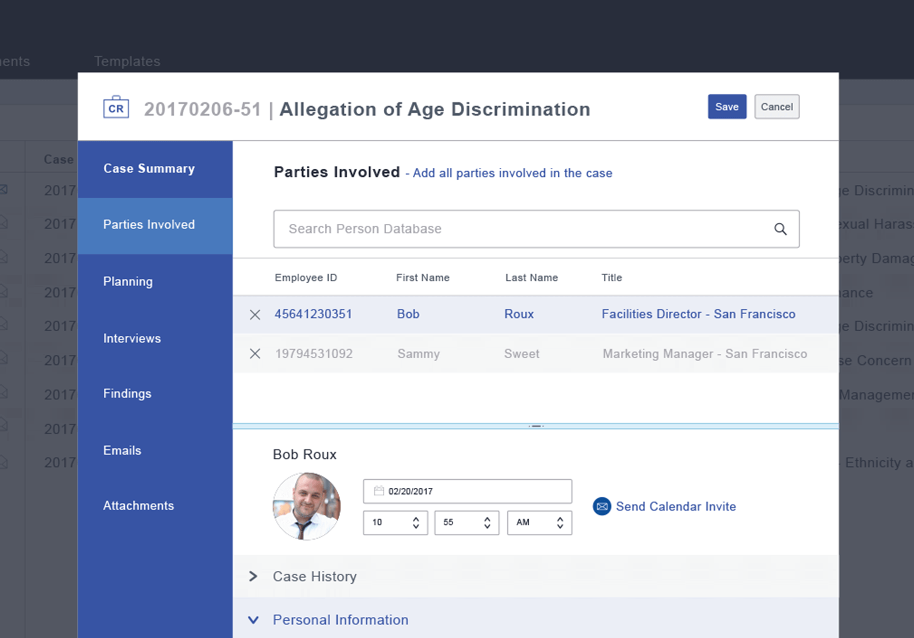
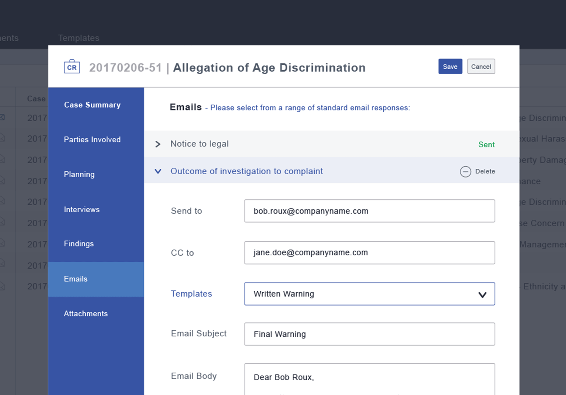
UI Mockups for Amazon
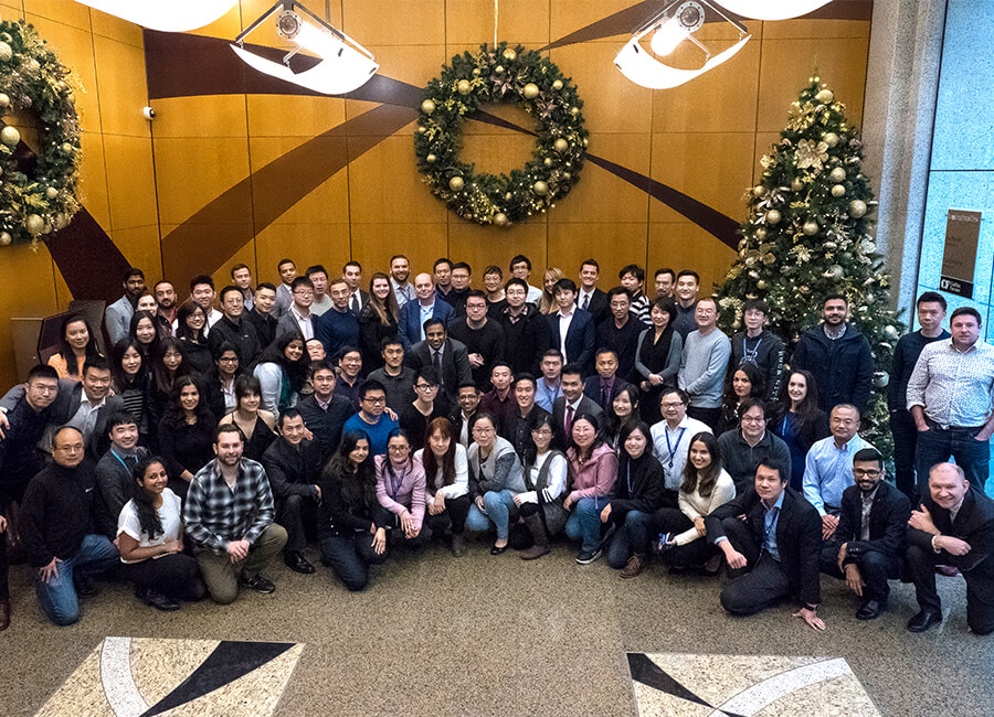
Two sales representatives reached out to me for help in closing a deal with Amazon, as the client had significant concerns about the UI/UX of our Case Management feature. They were worried it could lead to training issues and usability challenges. Collaborating closely with the sales team, I created several UI/UX mockups that illustrated the user experience of submitting a harassment report through our software. Taking into account both the client’s feedback and the technical limitations, I was able to design a solution that ultimately won the client over. This deal became one of the largest in D3 Security's history. Since then, I’ve watched the company double in size and move into a larger office space.


Conclusion
Before joining D3, I was unfamiliar with both physical and cyber security. However, with the support of my team, I quickly picked up the necessary terminology and security processes to succeed in my role. Together, we created highly successful content that garnered significant attention and helped secure several key clients. I’m grateful for the opportunity to work alongside such a supportive team and contribute to so many high-impact projects.
