Background
Clir had a remarkable year in 2021, achieving several milestones and accolades. They raised CAD$27 million in Series B funding, ranked among Canada’s top growing companies by the Globe and Mail, and received a Companies-to-Watch award from Deloitte. They also grew their marketing team from one to five members, including me as the Graphic and Digital Designer. I led the brand design and production for Clir, contributing to their ongoing success.

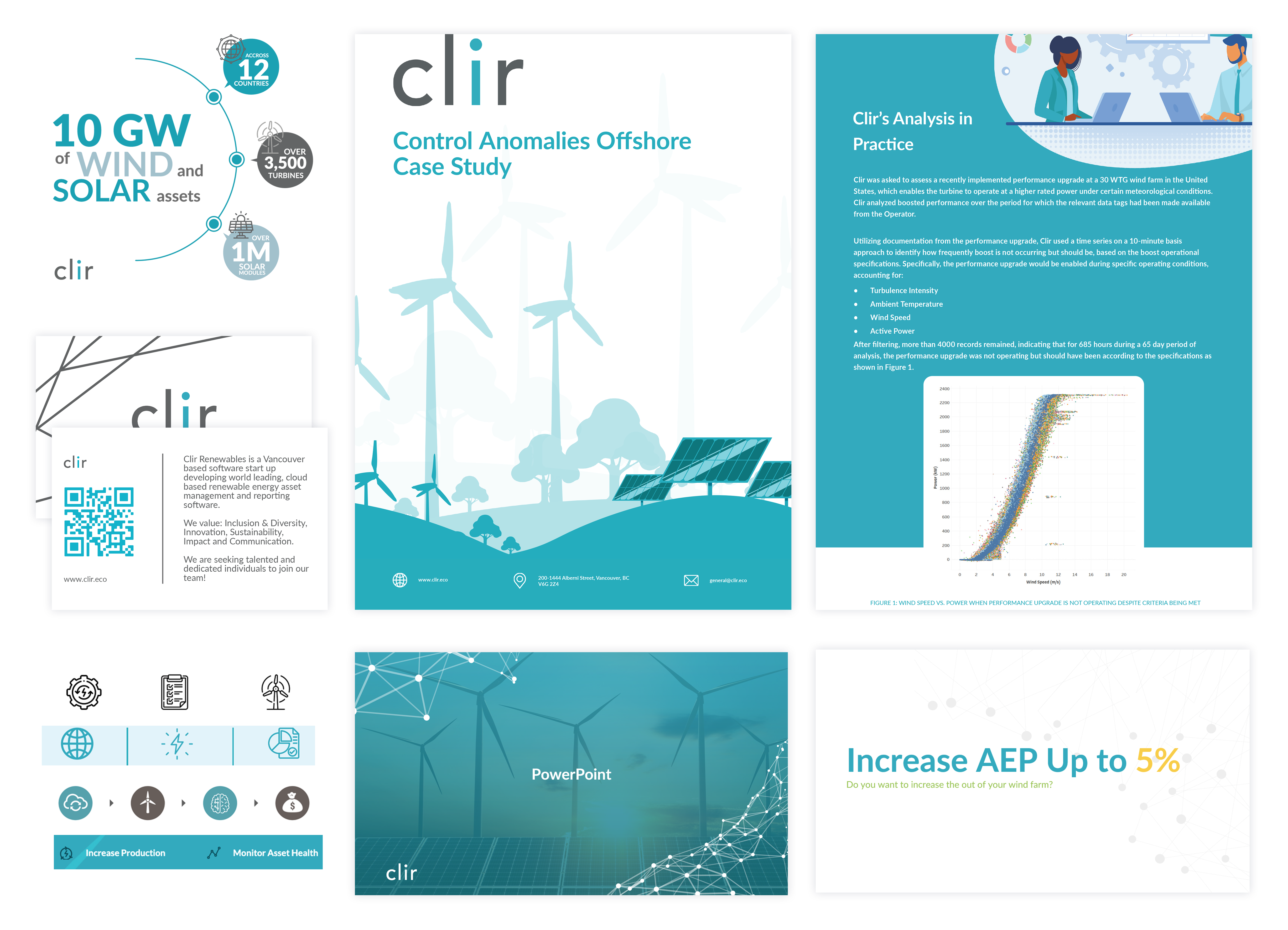
A sample of the previous branding
How I Refreshed Clir’s Brand Identity
Clir hired me with a challenge: they wanted a fresh and modern look that would reflect their brand name, which means “clear” in Welsh, and showcase their innovative solutions.
Clir’s brand identity was created in-house by an intern in true start-up fashion. Even before my start date, I knew that a brand refresh was most likely the way forward. During my brand audit, I identified the following issues:
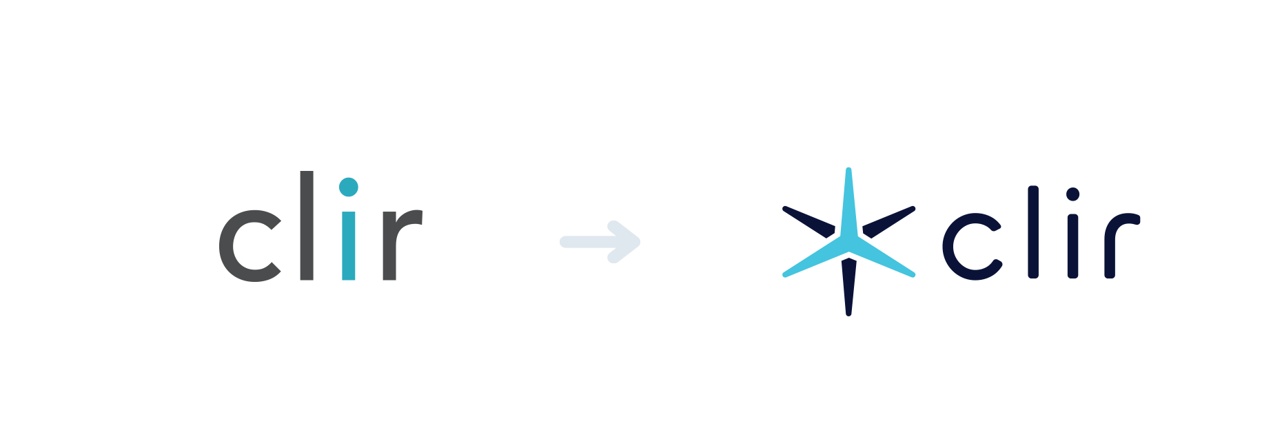
- The logo was bland and forgettable, as it was just Averta Standard font with no adjustments.
- The only visually interesting element was the blue-coloured “i”, which was lost when placed on most coloured backgrounds.
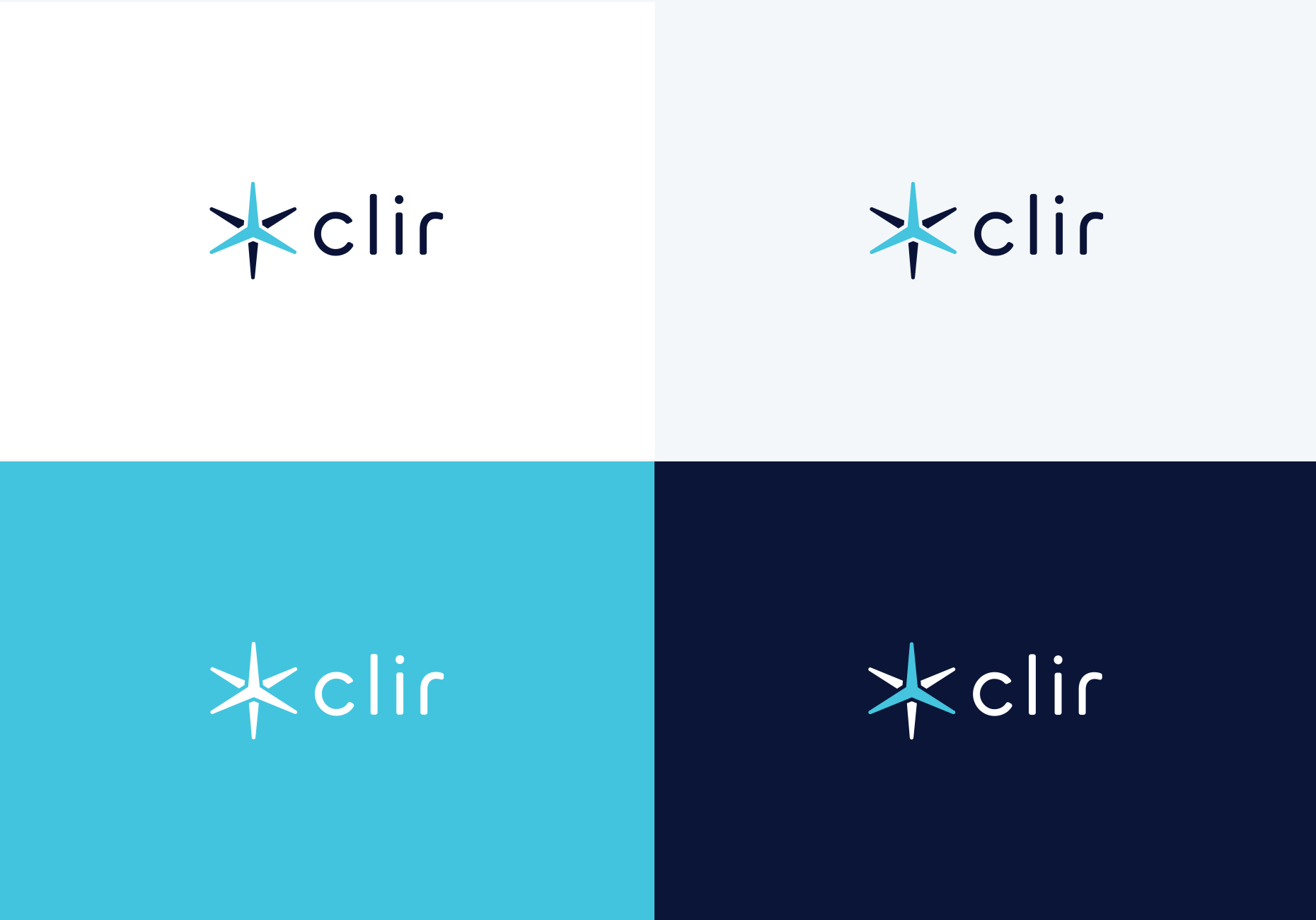
- The brand colours were muddled and limited the usage of the logo on coloured backgrounds. The additions of the yellow and green seemed random and last minute.
- Clir works with wind and solar clients but relies heavily on wind turbine imagery, which does not represent their full range of services.
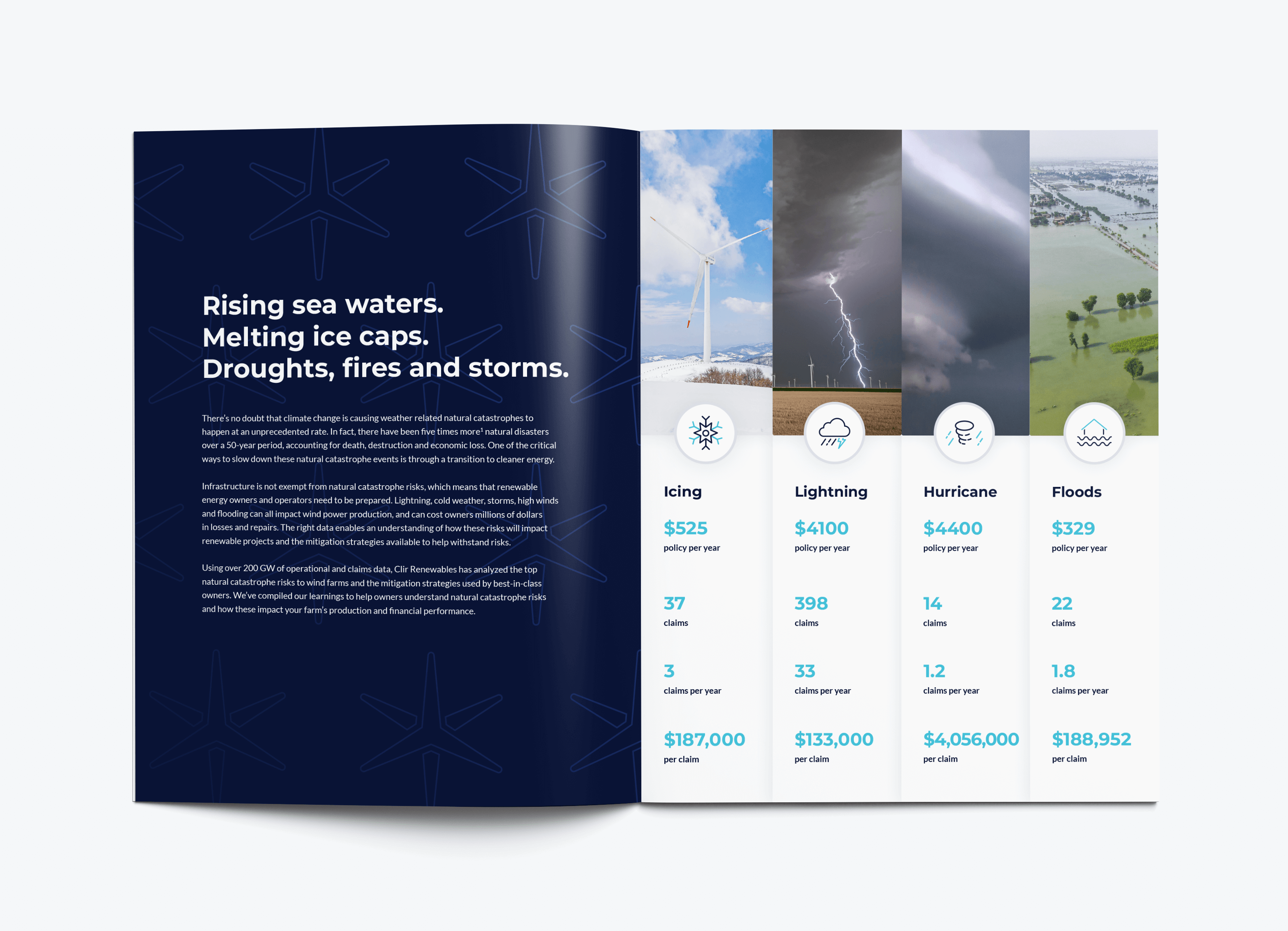
- Clir used cheesy stock photography, random icons and graphics, and stretched product photography, which did not convey their professionalism and quality.


I worked closely with the Marketing Director to understand their goals, target audience, and unique selling points. I proposed a brand refresh that would address their pain points and deliver the following benefits to Clir’s CEO and top-level execs in a tight 8 month deadline:
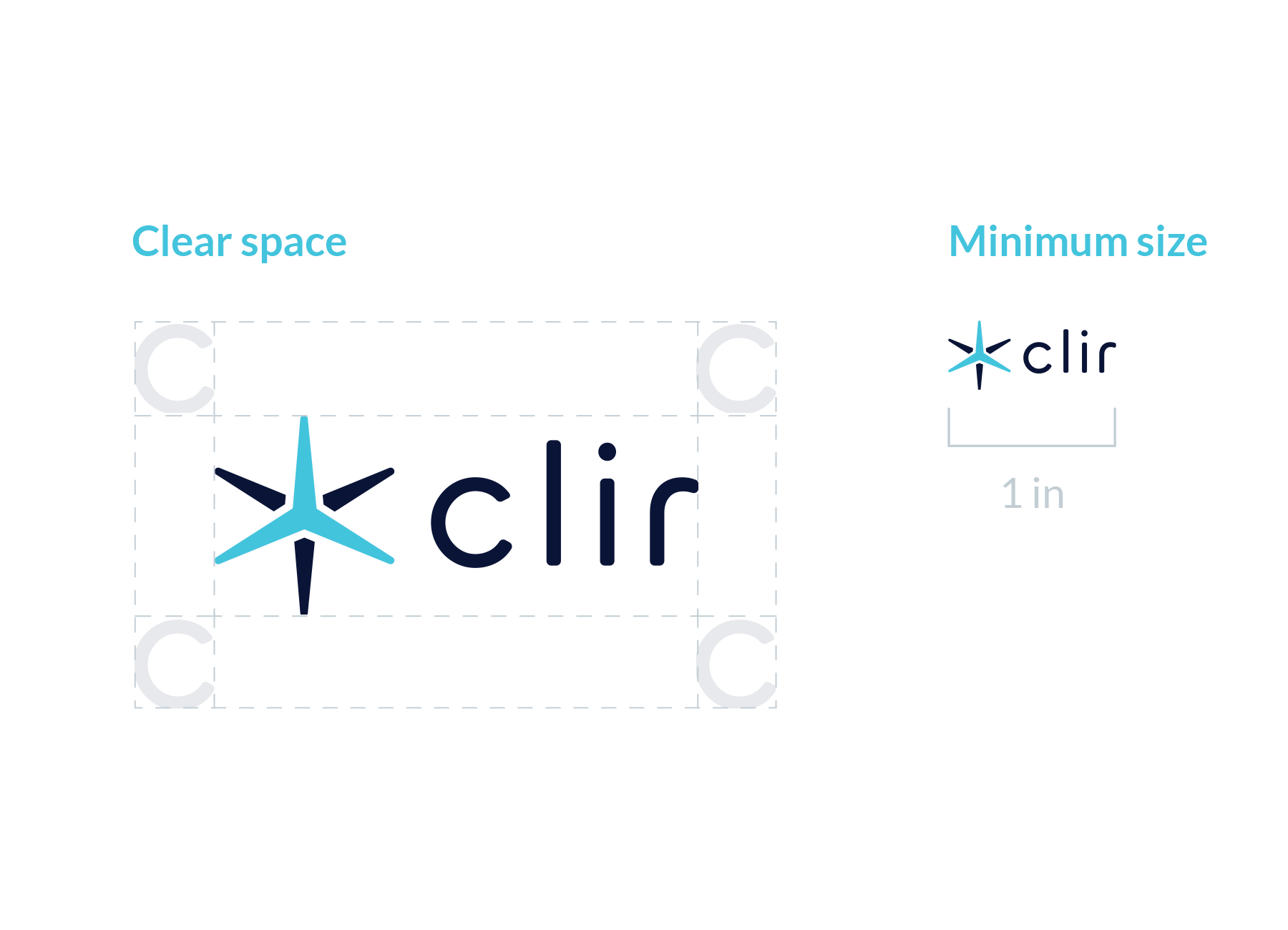
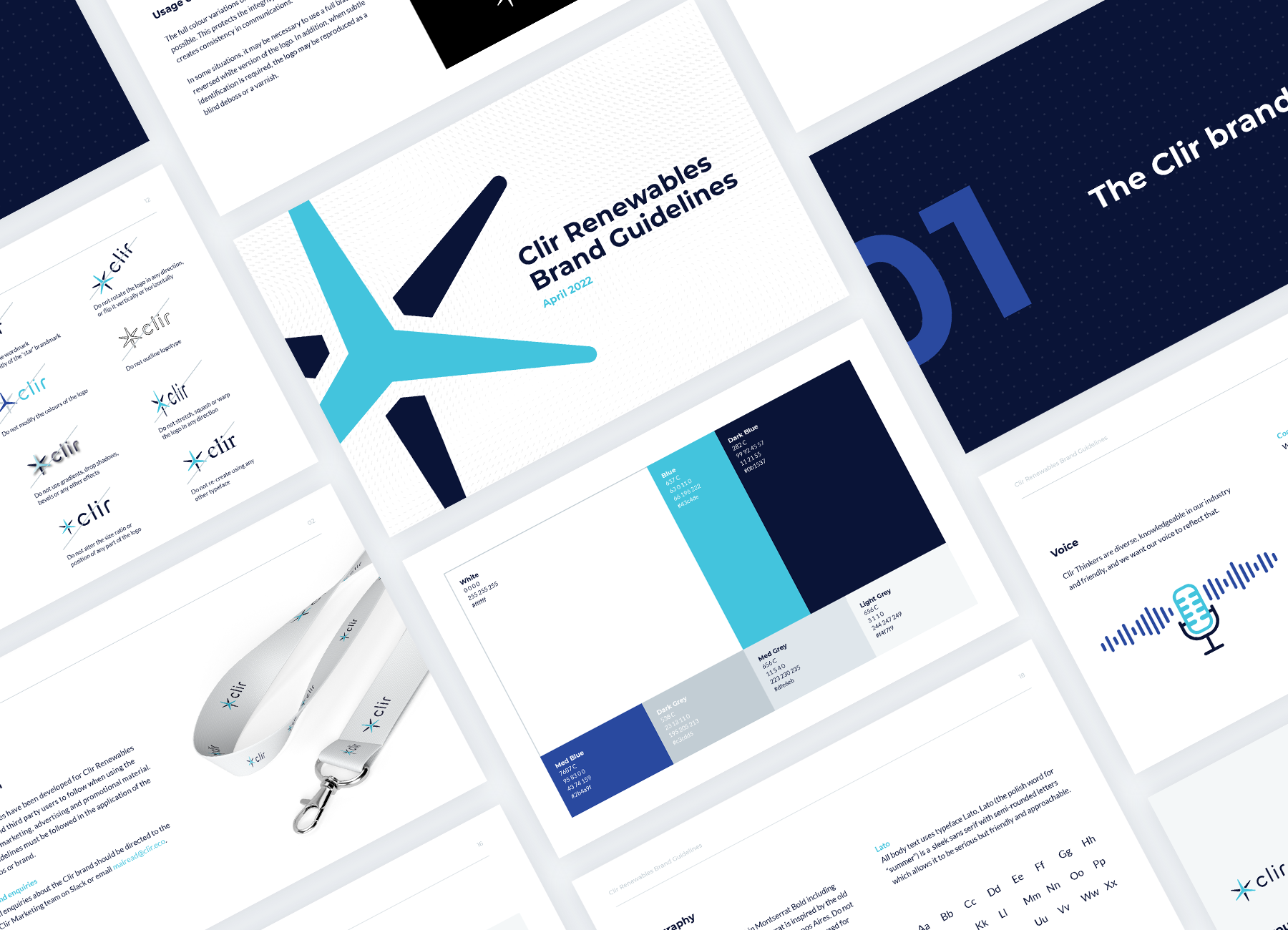
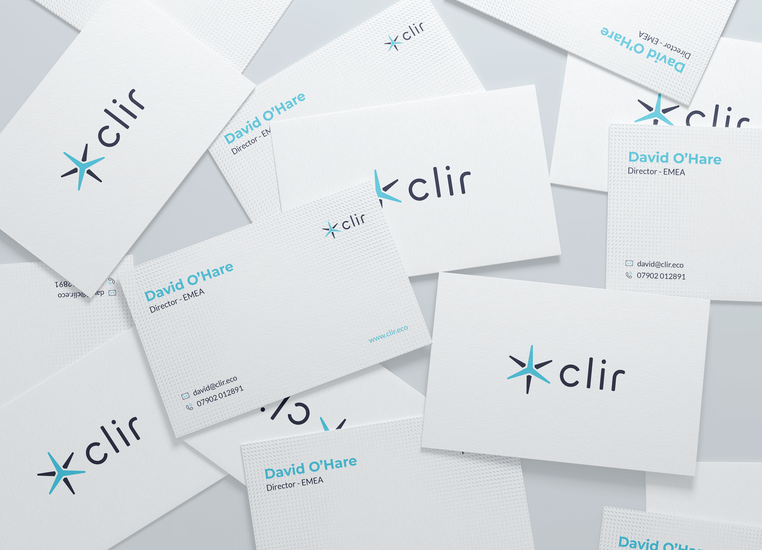
- A modern and distinctive logo that would combine the Clir wordmark with the Clir ‘star’ brandmark. The star would represent a wind turbine with a second turbine behind it to form a star like our sun. This would symbolize Clir’s focus on renewable energy and innovation.
- A clear and consistent colour palette that would use greys and brighter contrasting blues. This would align with Clir’s brand name and create a sleek and professional look.
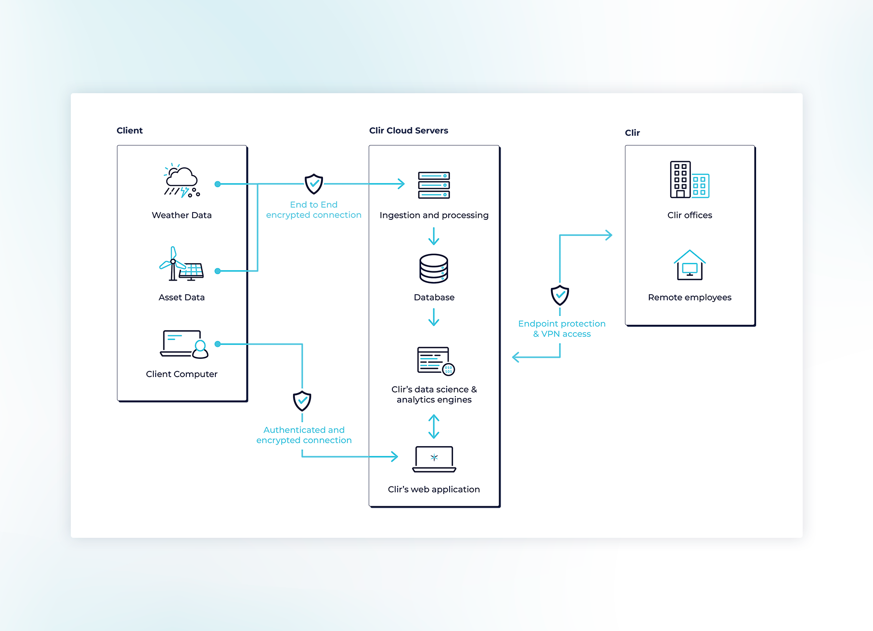
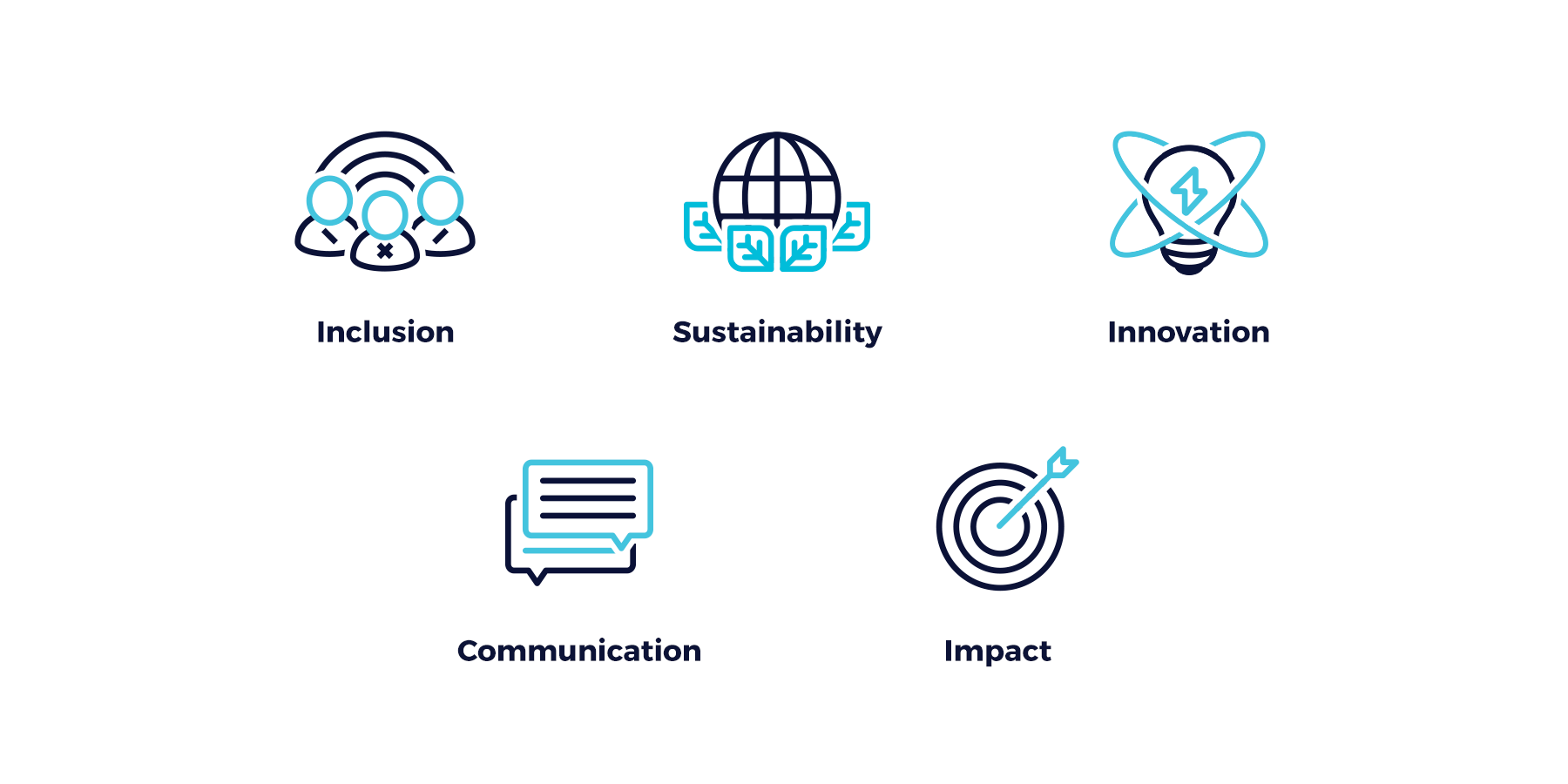
- A custom and coherent icon set that would be created in two sizes for a wider range of contexts. The icons would be outlined to keep with the lightness and rounded corners for a more approachable look.
- A new and improved website that would feature the new logo, colours, icons, and graphics.
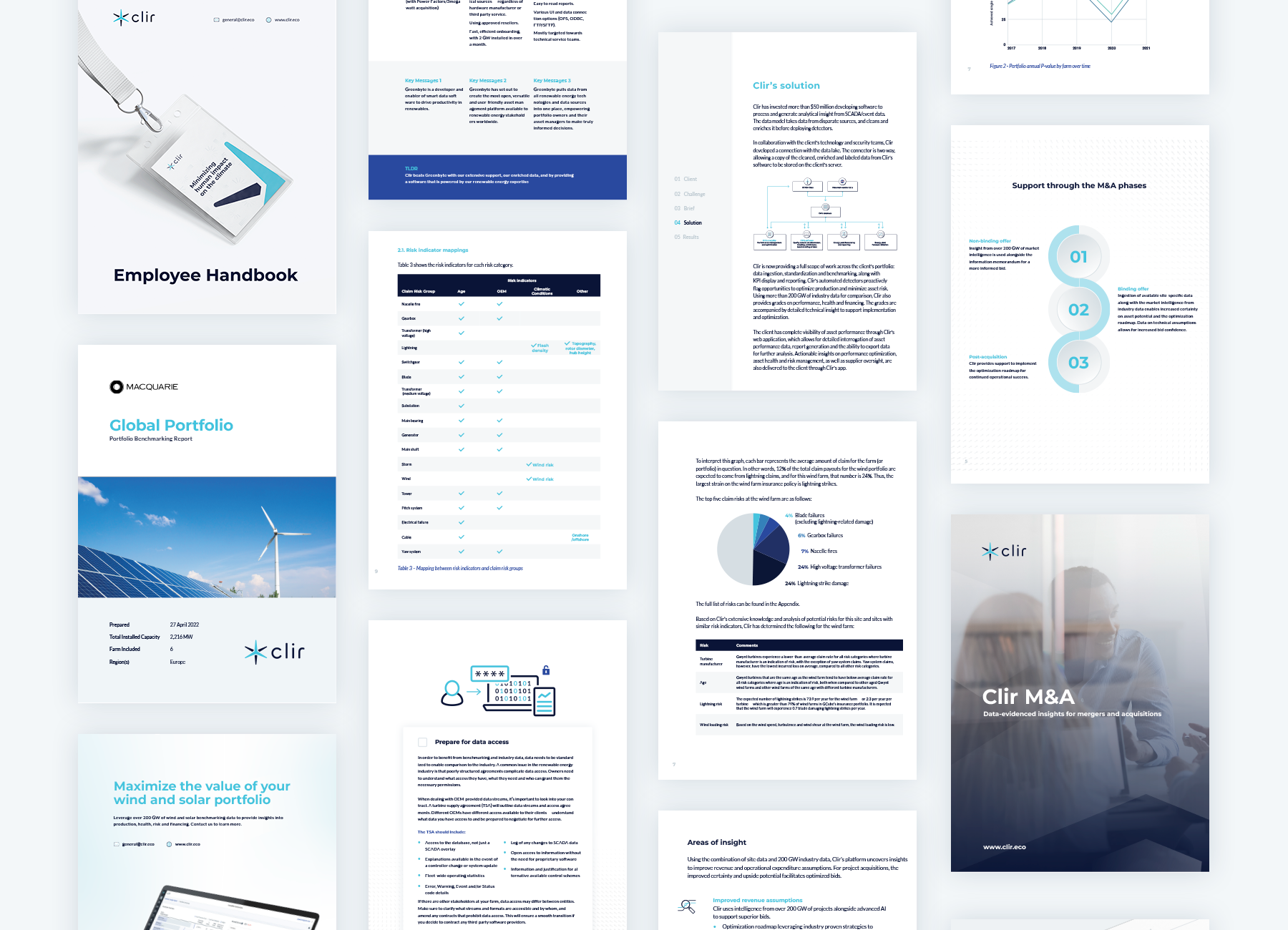
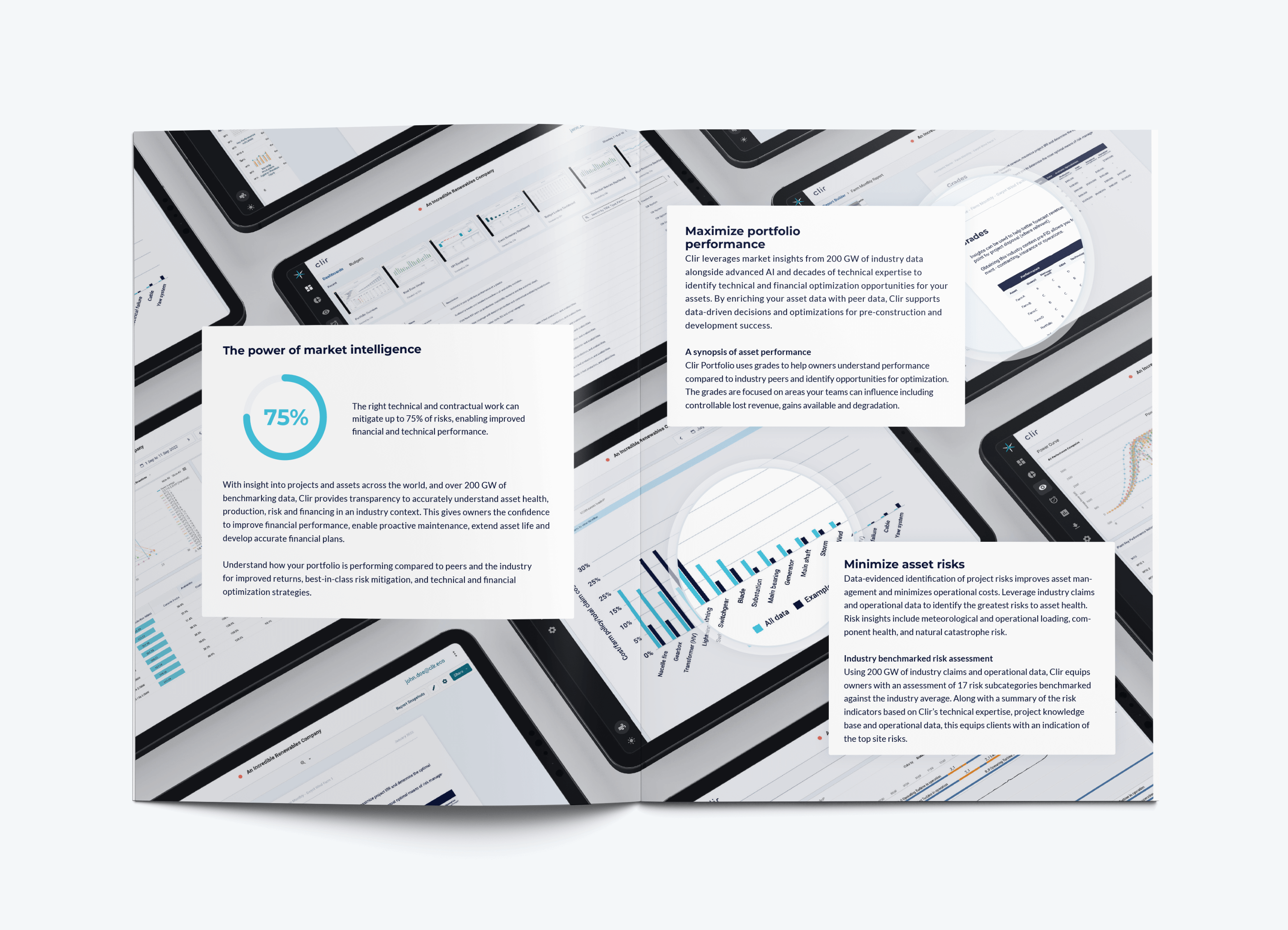
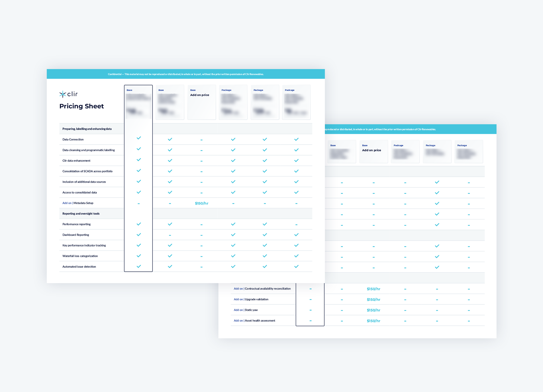
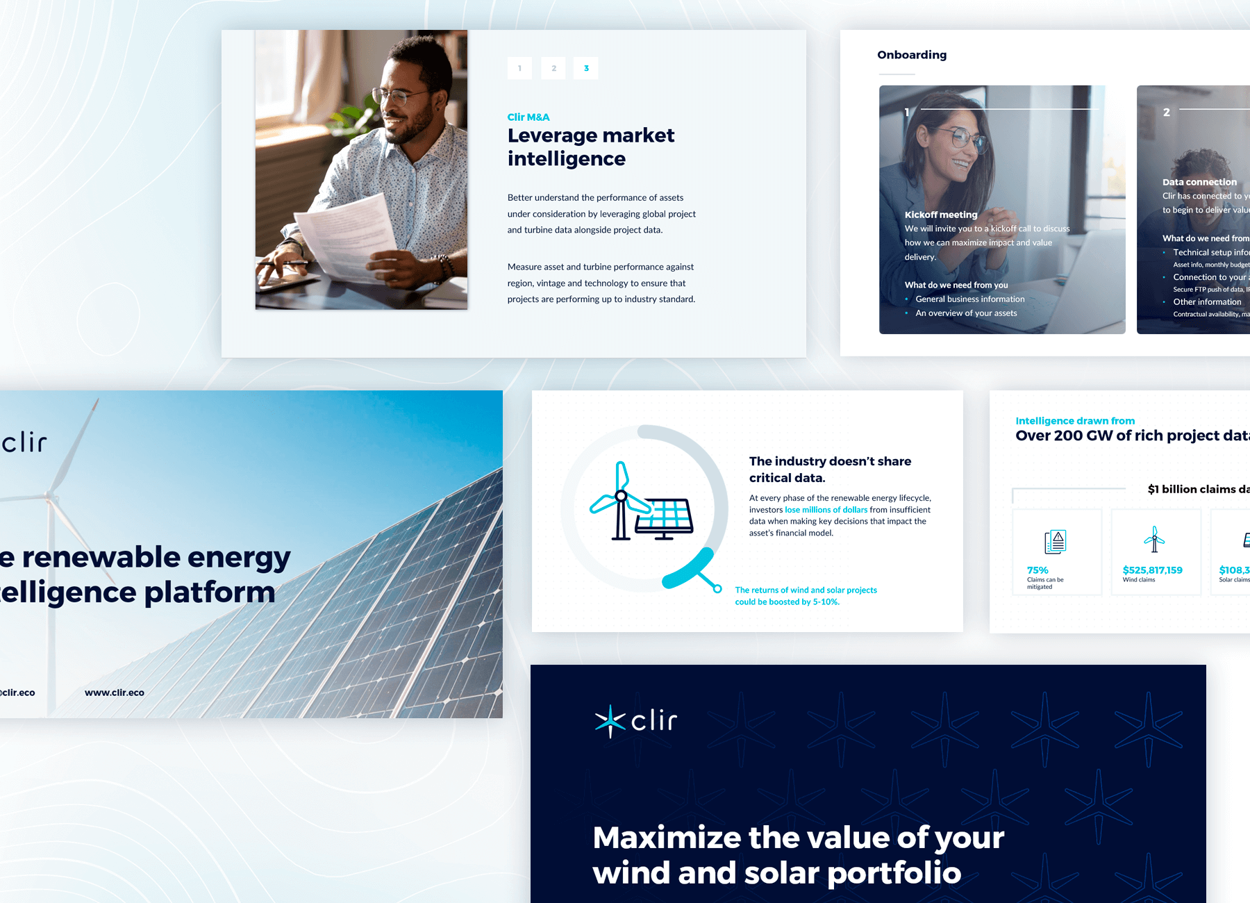
- A new and updated set of marketing materials that would include PDF templates, PowerPoint slides, and company swag. The marketing materials would use the new logo, colours, icons, and graphics to create a consistent and memorable brand image.




Social Media
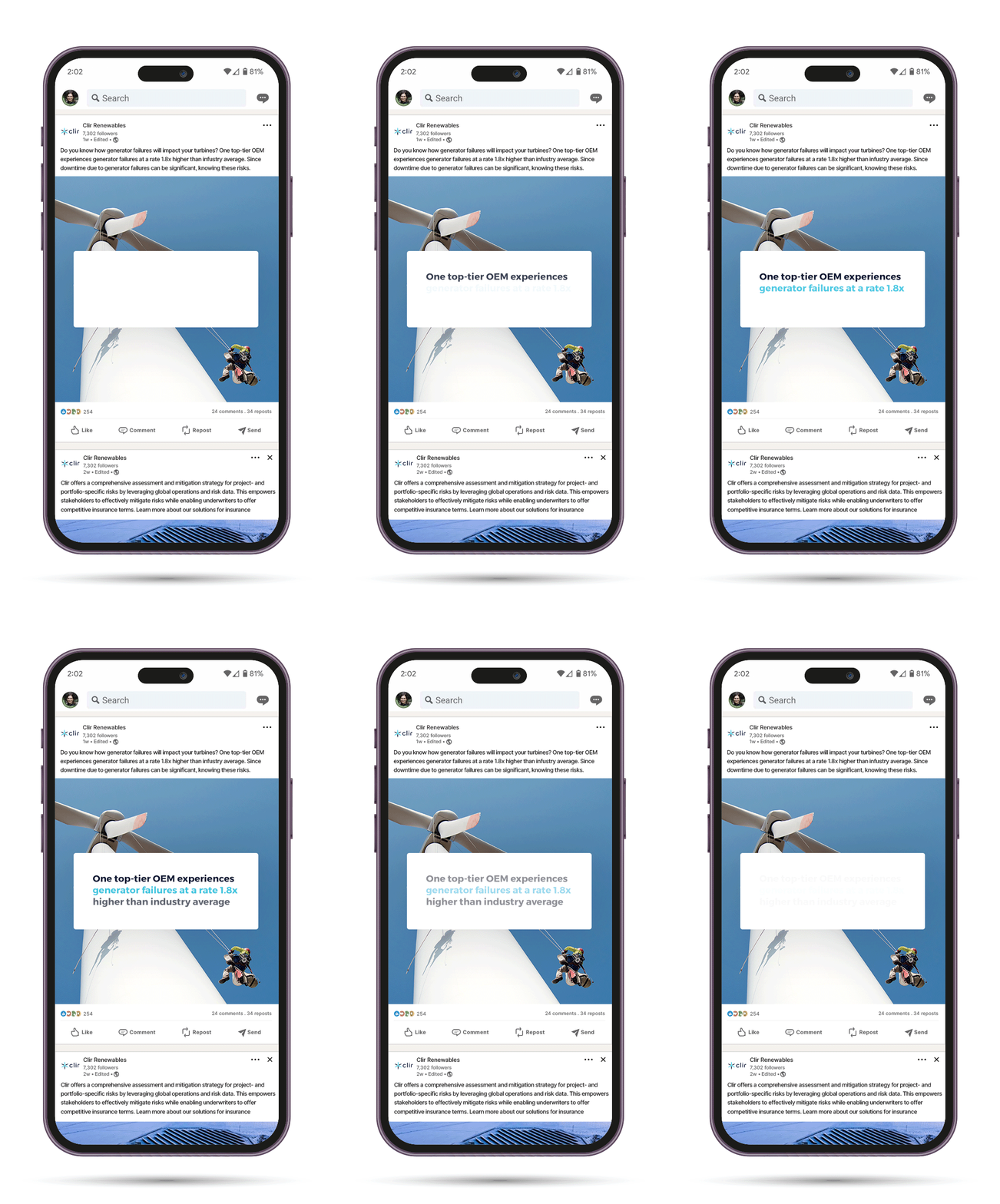
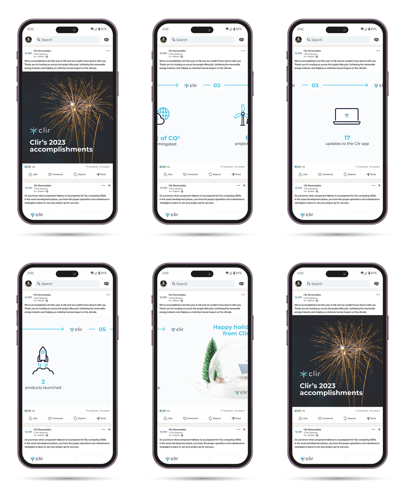
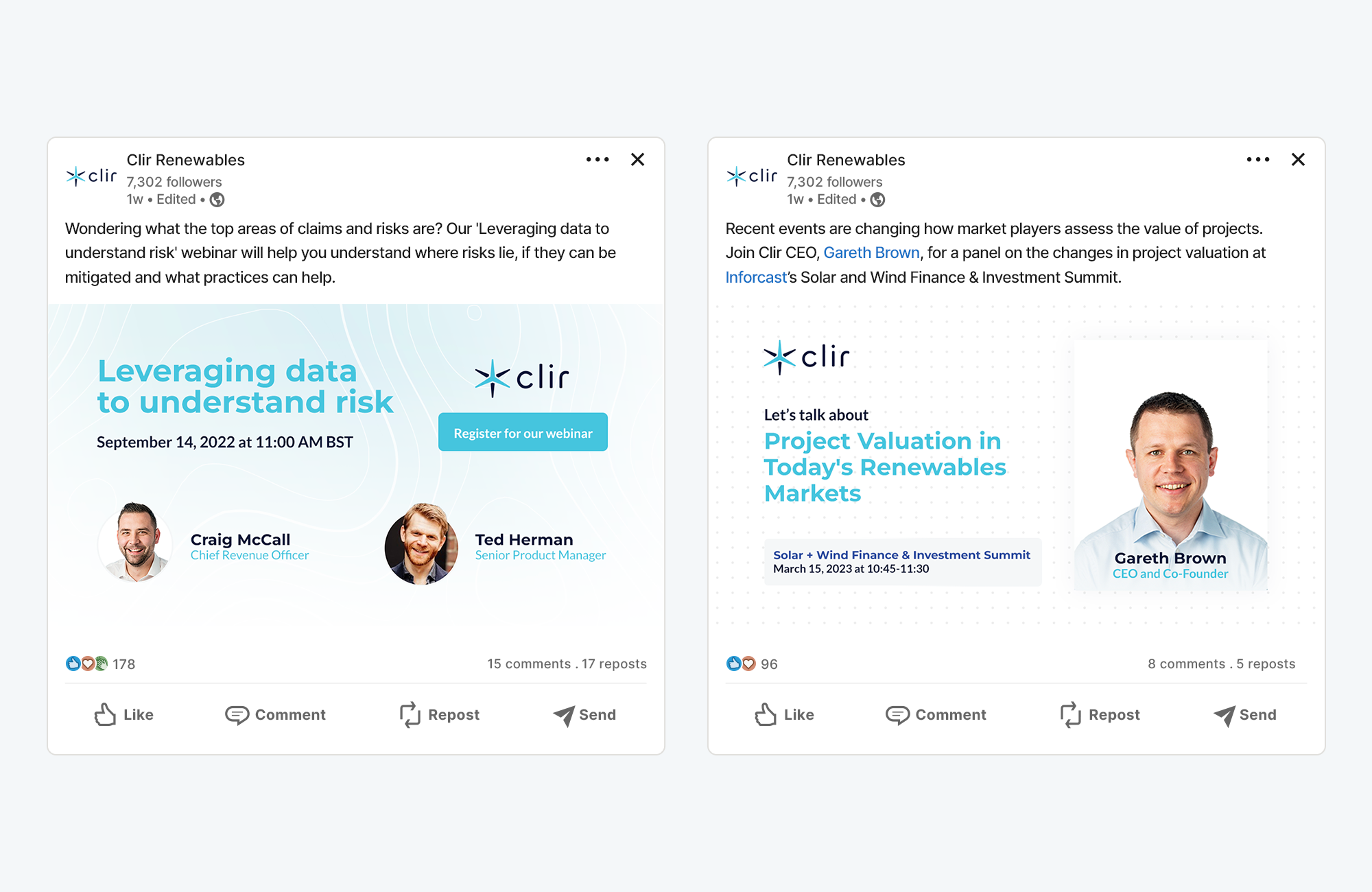
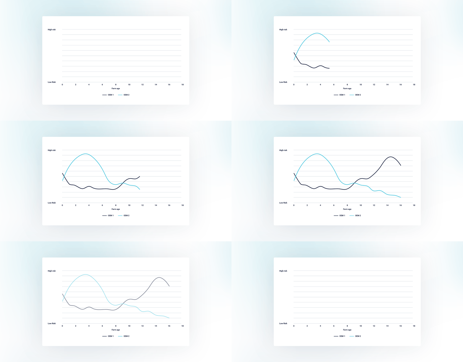
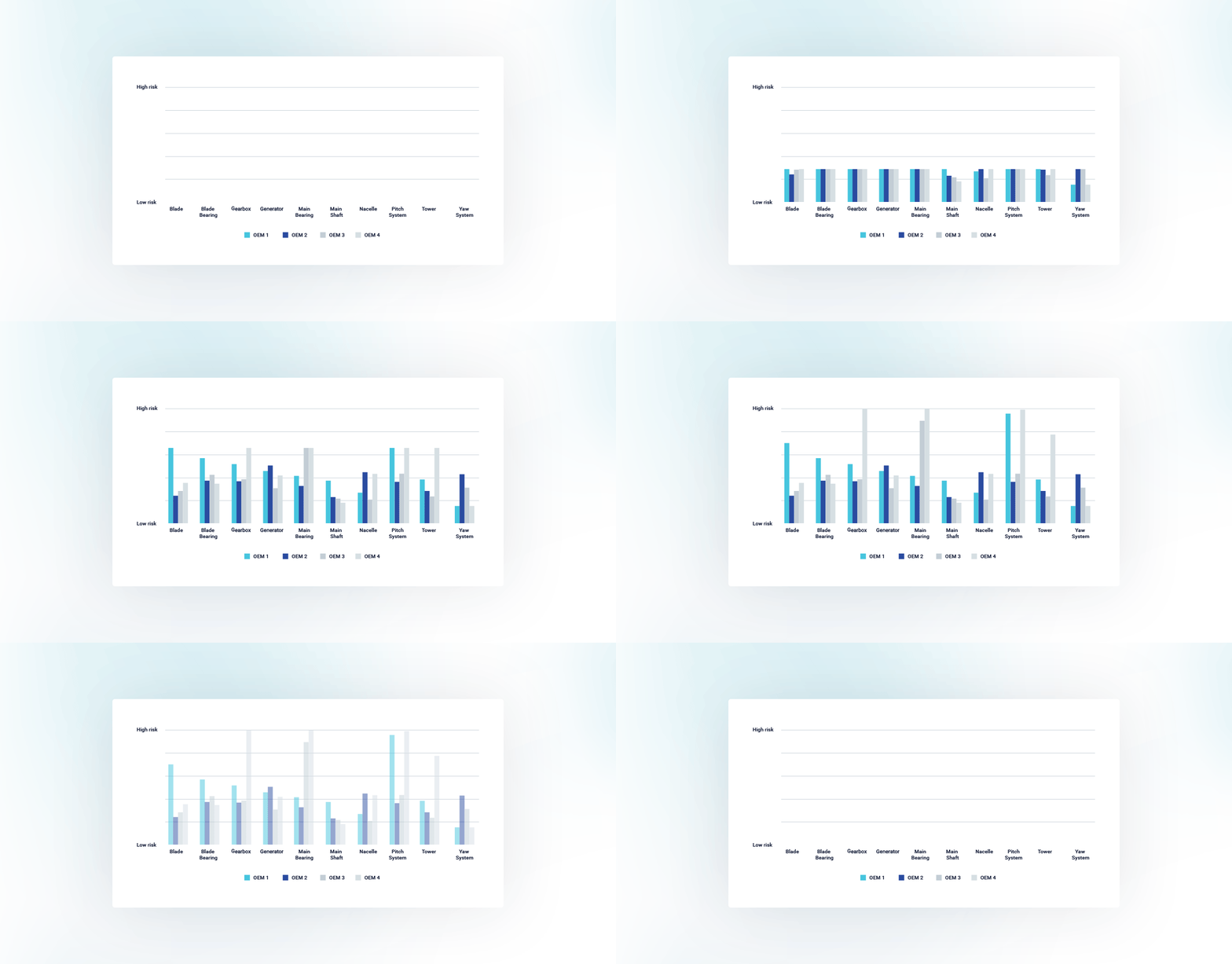
Clir’s primary social media platform is Linkedin, where they used to rely on stock photos and shared posts from other sources. I designed original templates for events, blog posts, and PDF carousels, and added animation to make data graphs more engaging. The CEO praised my work and reported that our posts resulted in new leads and connections.


PDF and Presentation content
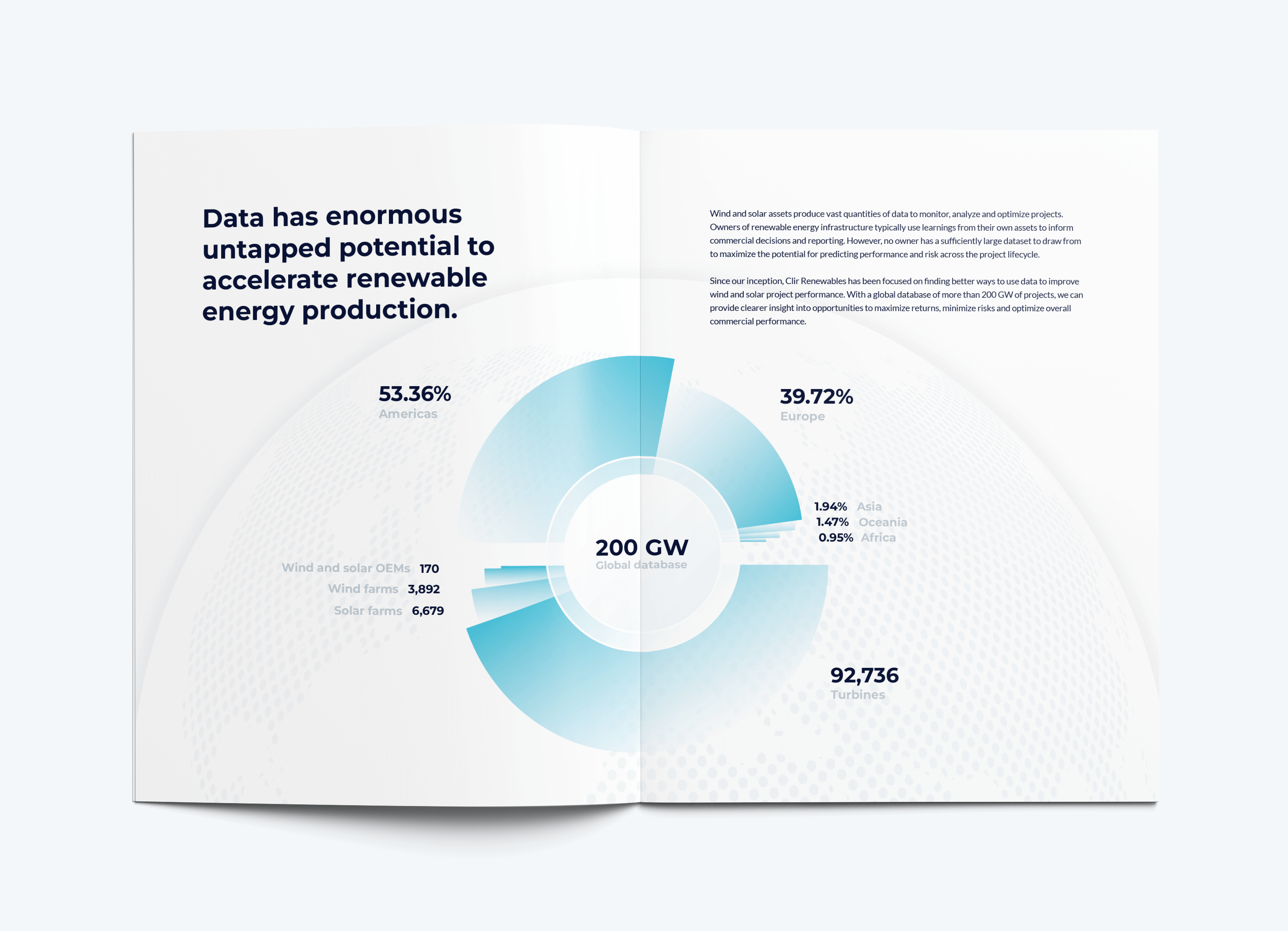
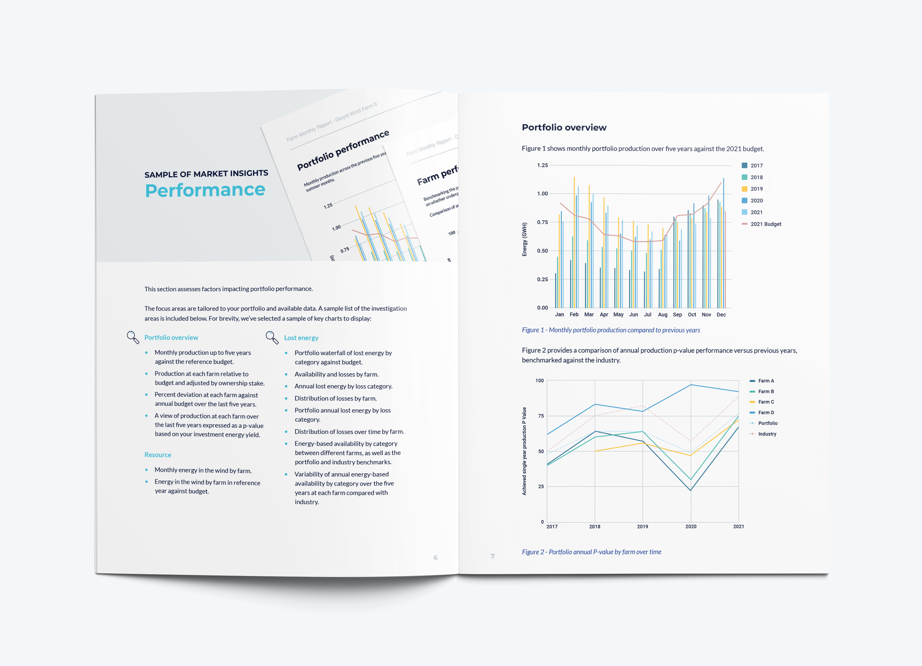
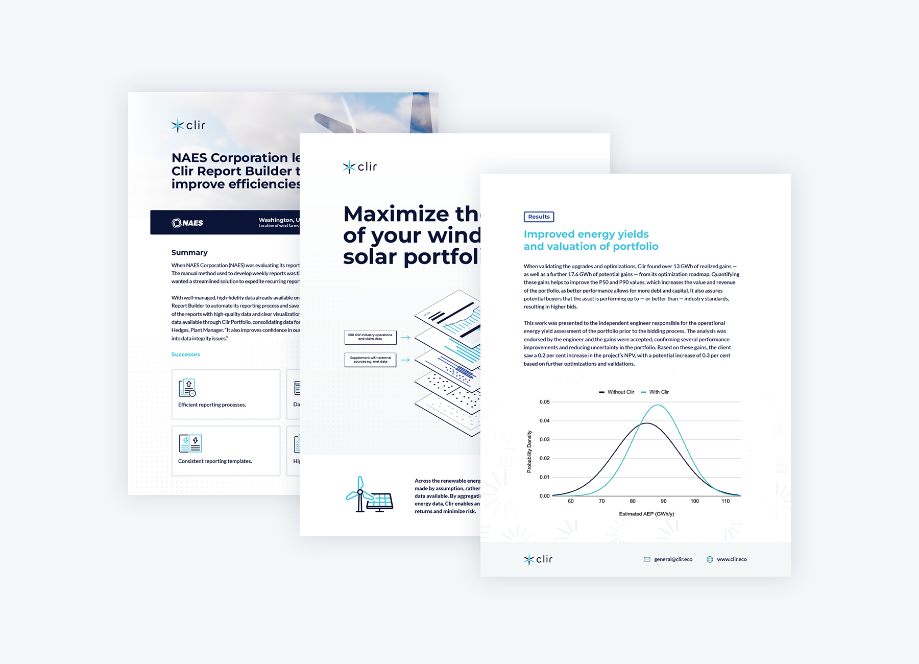
Clir had a limited and repetitive portfolio of six case studies that showcased their value proposition. Working with the content manager, I redesigned the case studies to make them more appealing and concise. We also added 11 new case anonymized studies and three with client names. We diversified our PDF formats to include white papers, one-pagers, and product brochures. Additionally, I designed PowerPoint slides for various purposes, such as webinars, presentations, and investor pitches.


Website redesign
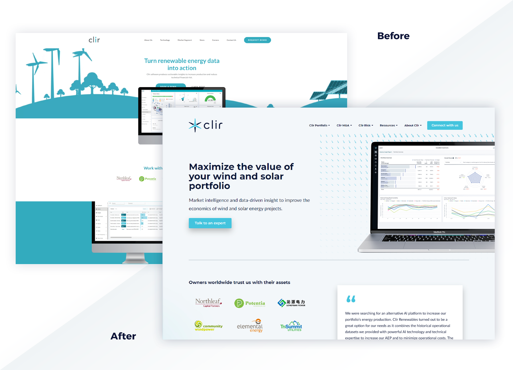
I was surprised to learn that the website had been updated the year before and not in 2010. It was outdated, unappealing, and ineffective at generating leads. We wanted a fresh and modern look that would reflect the brand identity and showcase Clir's innovative solutions.
The website had several issues that affected its performance and user experience:
- Design was outdated and inconsistent with the company’s new logo and direction.
- The content was dense, technical, and hard to read.
- Navigation was confusing and cluttered with too many options.
- The website lacked a clear value proposition and call to action.
- Used a limited CRM that made it difficult to manage and update content.


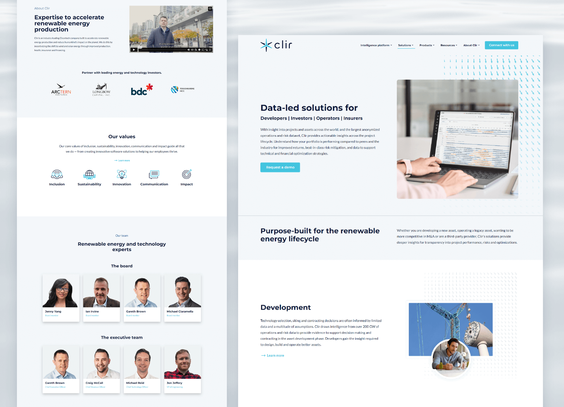
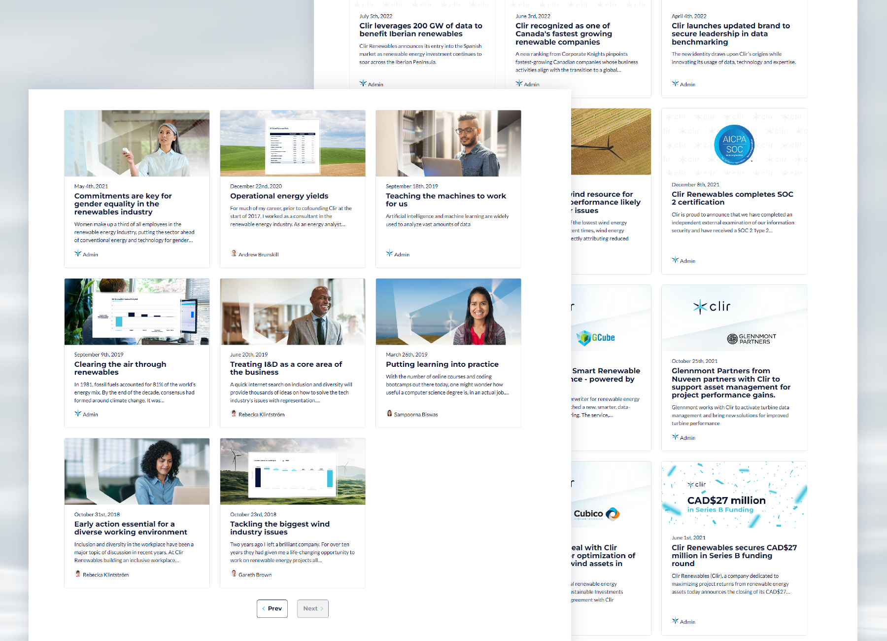
We switched to HubSpot as our CRM platform, as it offered a comprehensive suite of tools for marketing, sales, and customer service. We also interviewed several web design agencies and selected the one that best matched our vision and budget. We collaborated with them to create the wireframes and mockups of the new website. Internally, we provided the copy and graphics for more than 18 new website pages, following the best practices of web writing and SEO.
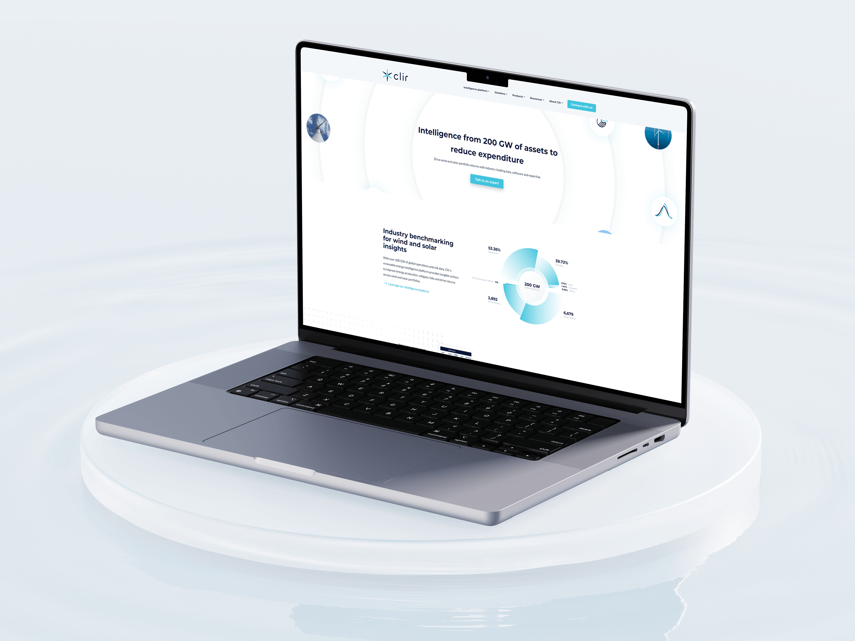
We launched the new website in April 2022, after an 8-month process of planning, designing, and developing. The new website was a huge success, as it achieved the following results:
- A modern and responsive design that aligns with the new brand identity.
- Clear and concise content that highlights our value proposition and showcased our expertise.
- Simple navigation that would guide the users to the most relevant and important information.
- Strong and prominent call to action that would encourage the users to request a demo
- A robust and flexible CRM that enables us to easily manage and update our content and track our leads.


Physical Materials
Clir is a fully remote company that operates from two offices in Vancouver, BC and Glasgow, UK. Since we only need physical materials for the tradeshow season, we minimize our environmental impact and uphold Clir’s core value of sustainability. Marketing commissioned a makeover for the main Vancouver office hallway, featuring Clir’s light grey paint and new acrylic signage for investor visits. We also ordered limited runs of company swag to celebrate the launch of the new brand.


Conclusion
Working at Clir Renewables was a rewarding and challenging experience that helped me grow as a marketing professional. I had the opportunity to collaborate with some of the most enthusiastic and brilliant people and the chance to contribute to the expansion and elevation of the brand. Clir Renewables is a company that is making a positive impact on the world, and I am proud to have been a part of it.
